
Hatch Finances (Google UX Design Course Project)
PRODUCT DESIGN
Budgeting and financial tracking app that empowers young adults to accomplish their goals with their peers faster.
OVERVIEW
Role: Product Designer (UX Design, UI Design, User Researcher), Visual Designer
Timeline: 16 weeks
Problem: Young working adults need to calculate their savings more efficiently to hit big milestones such as buying a home and starting a family. Many of them are currently doing it manually and inconsistently.
Solution: Designed and iterated on a budgeting and financial tracking app concept that empowers young adults to accomplish their goals with peers faster. (Slide Deck)
Impact: Many potential users showed interest in the app and want a simpler solution to track their financials with their family members.
Takeaway: Improved skills on designing inclusive and accessible online experiences and gained a better understanding of UX research methodologies.
THE GOAL
How might we make the financial planning process easier and more collaborative for young working adults so that they can reach their goals faster?
THE PROPOSAL

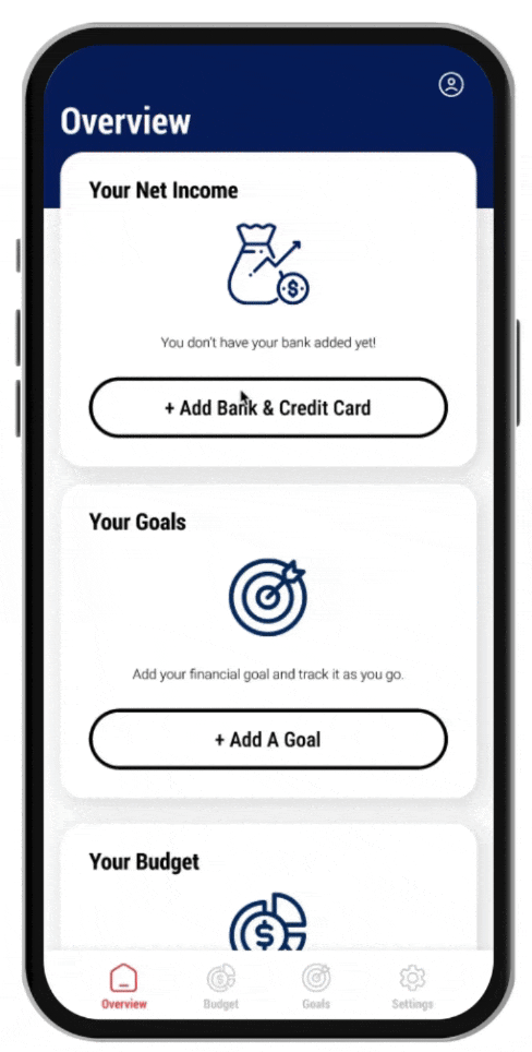
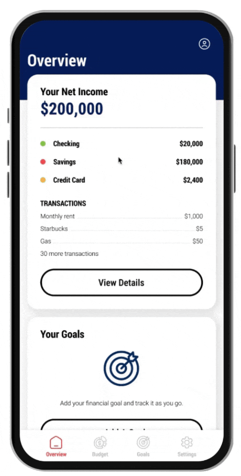
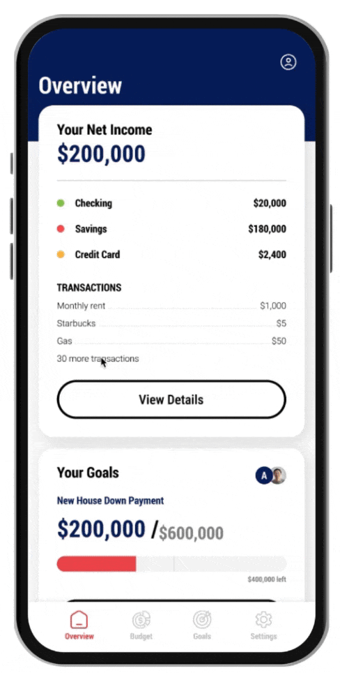
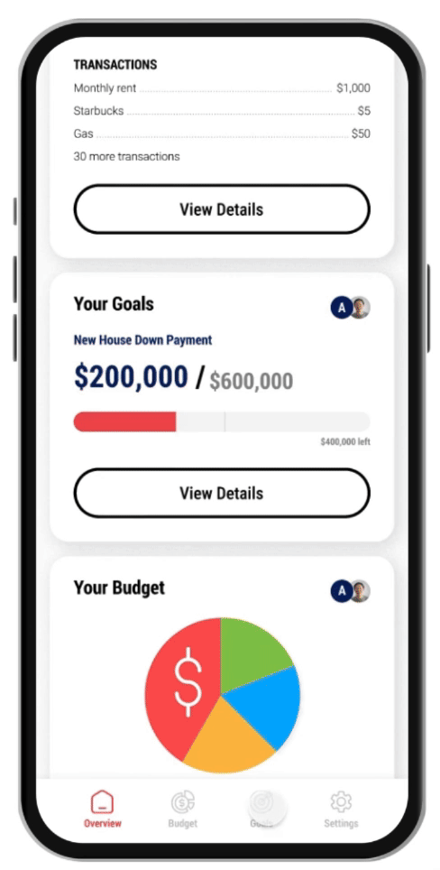
Hatch Finances is a budgeting and financial tracking app that empowers young working adults to accomplish their goals with peers faster. Users can connect their bank, set up and share their goals easily, and create simple budgets.
Further vision for this concept is to include AI-powered financial tips and allow more room for customization on budgeting categories. The goal is to make this experience more intuitive and appealing than tracking financials on spreadsheets.
EMPHATHIZE
USER RESEARCH INSIGHTS
Interviews and surveys (5 participants) were conducted following a research plan to gather insights on the current financial tracking process of young working adults. Common pain points were:
Inputting - Manually adding in income and expense numbers is time consuming and tedious. Users would love to track their financials easier but they don’t know other ways.
Remembering - Forgetting to track financials each day and month. Most of the tracking is done manually online.
Categorizing - Categorizing the spending takes up a lot of time. As users track their financials manually, it is hard to keep track of all their spendings.
Calculating - Doing the calculations to see where you’re at can get confusing. Many people don’t know what kind of information they should be tracking.
KEY OBJECTIVES
Track - Track spending to see where money is going
Save - Save up for bigger purchases
Align - Better financial decision making especially between partners
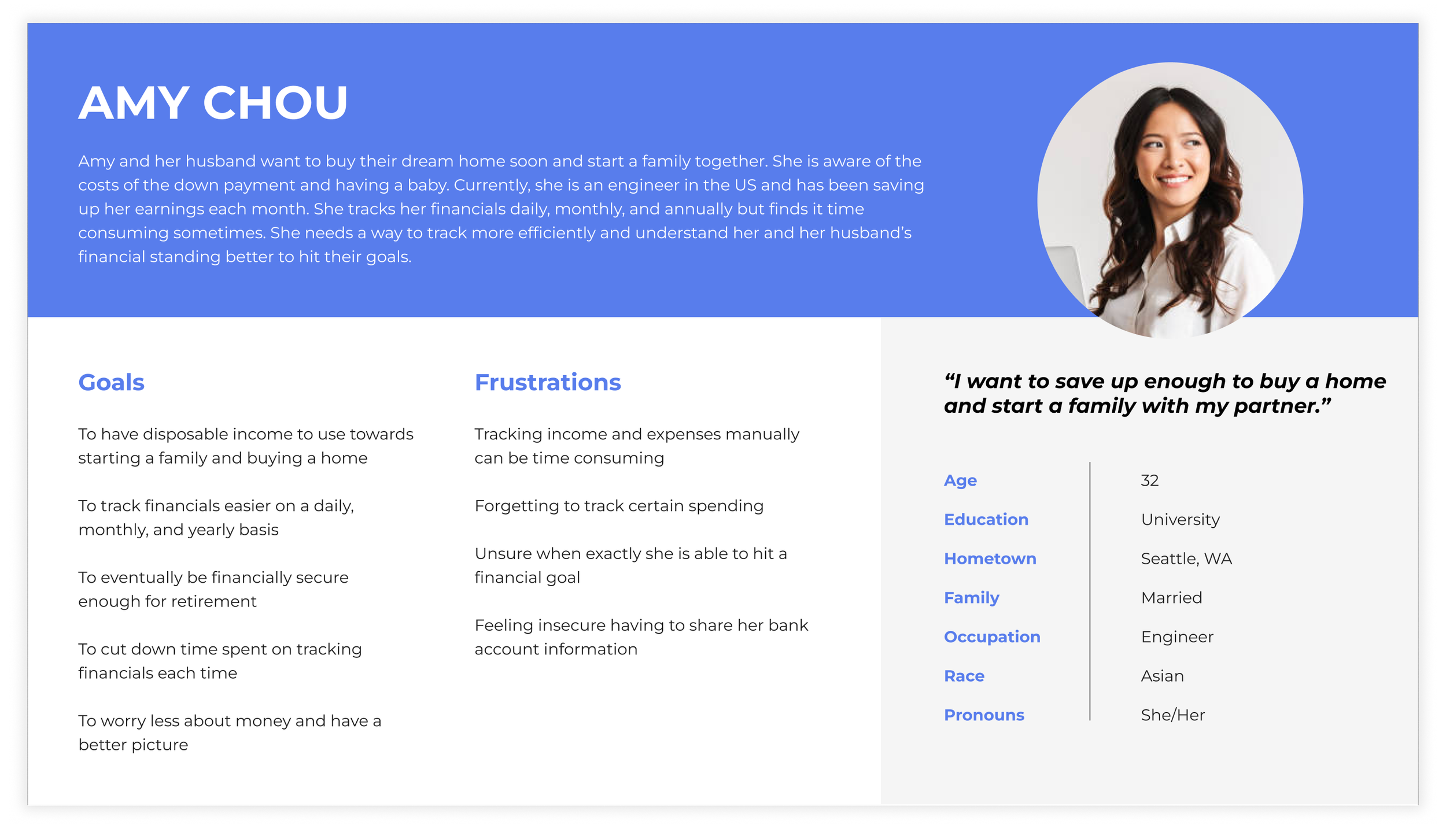
PERSONA
Amy is a married software engineer who needs to calculate her savings to buy a new home because her and her husband want to start a family together soon.
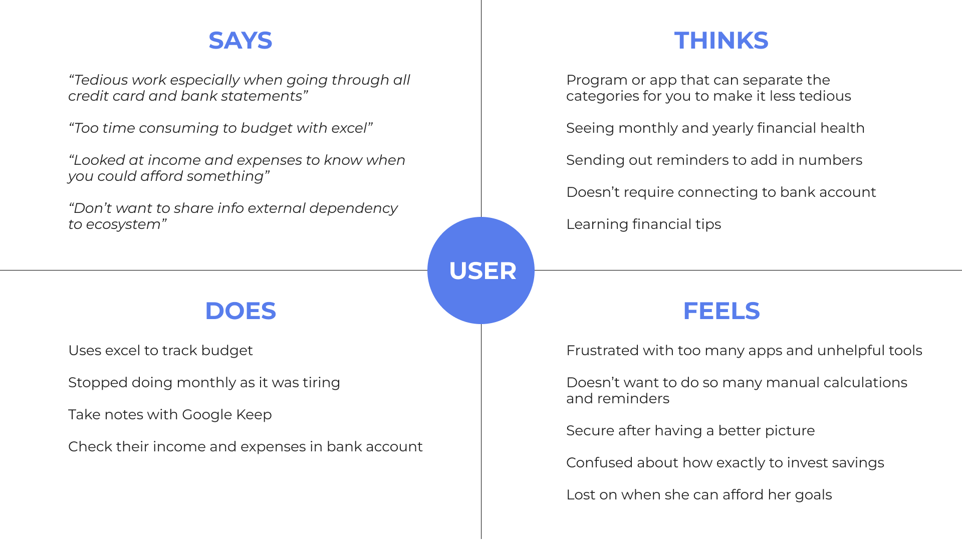
Empathy Map
The Empathy Map highlights common insights of shared pain points and thoughts throughout the process. There’s a lot of frustration around manually tracking financials and working towards goals with family members or friends.
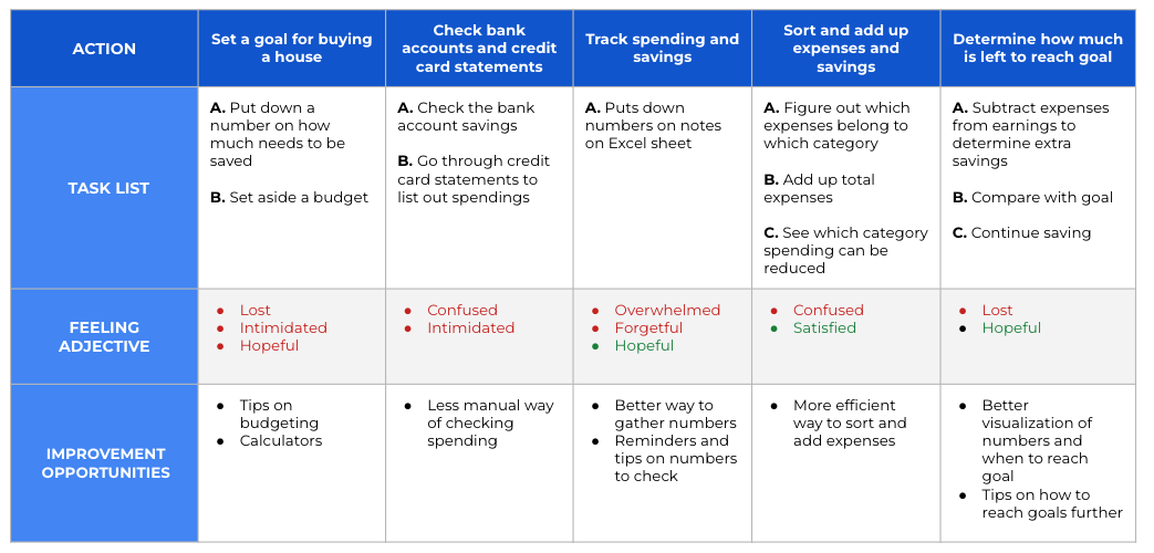
User Journey Map
There is a lot of friction in the current process of tracking financials. The user journey map illustrates Amy’s feelings, goals, and pain points throughout the process.
DEFINE
PROBLEM STATEMENT
Amy is a married software engineer who needs to calculate her savings to buy a new home because her and her husband wants to start a family together soon.
IDEATE
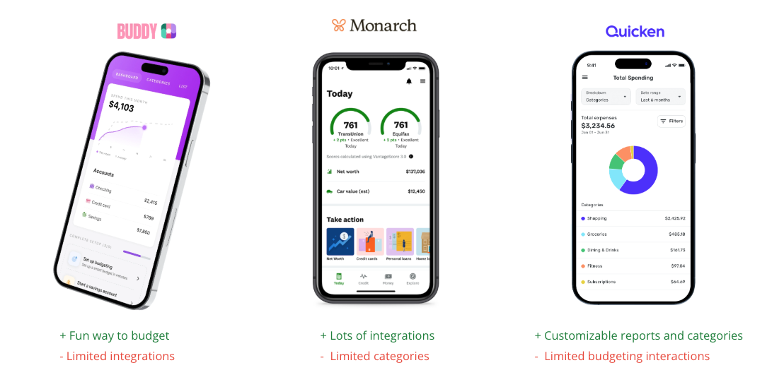
COMPETITIVE ANALYSIS
I conducted research on existing platforms that accomplish the same goals to understand what has been done and tested. A lot of these platforms had way too many features and made it confusing. There also isn’t a way to share with others.
IDEATION & STORYBOARDING
Several other ideas were considered such as an interactive piggy bank, wallet, or financial advisor service. However, many of these require extra effort to buy the product and remember to use on a daily basis. An app is the simplest as someone like Amy already has a phone with her and is using it daily.
Additionally, storyboarding was also conducted to understand Amy when she is in the exact scenario in which she would need the platform to help her.
PROTOTYPE
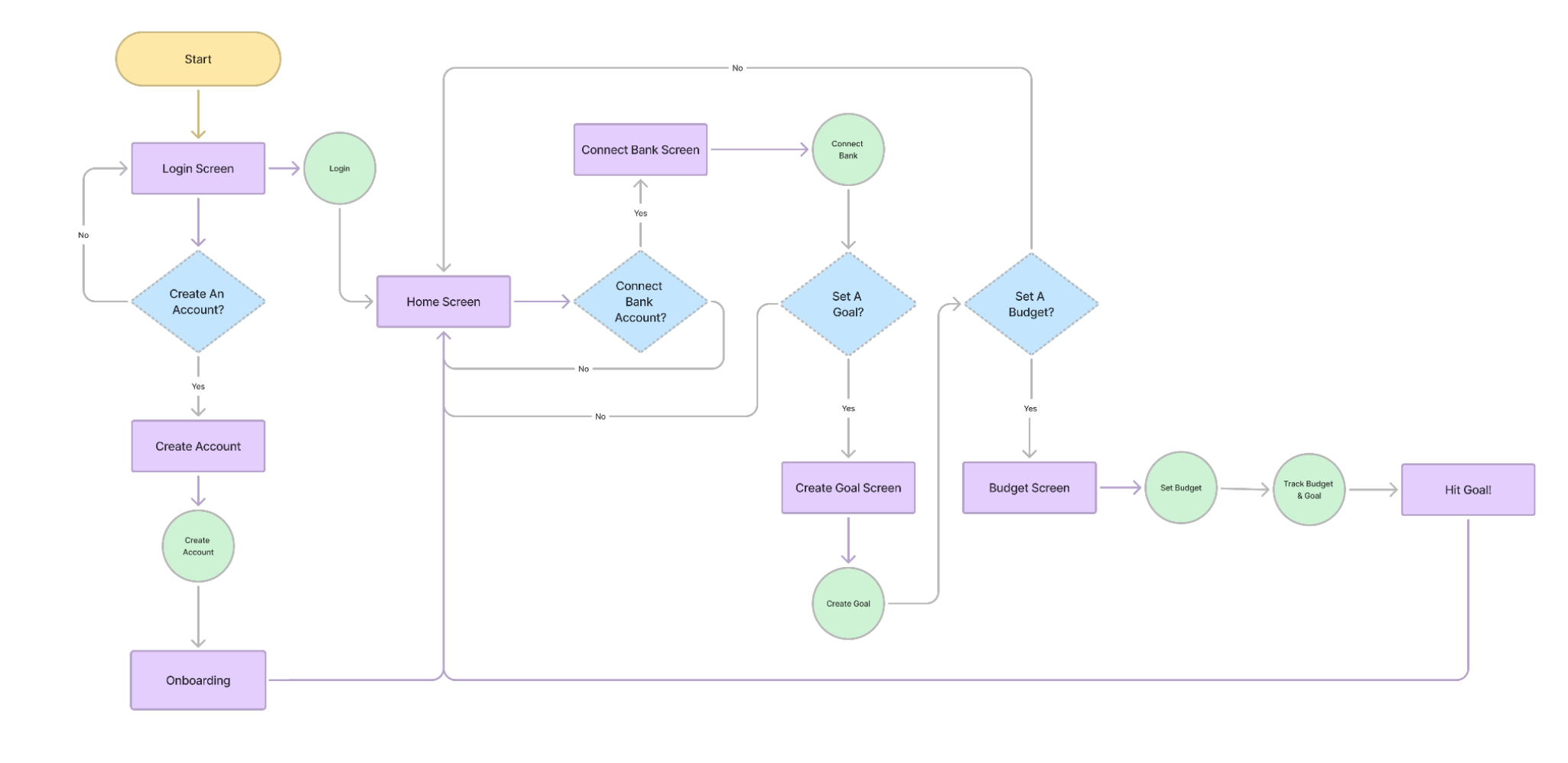
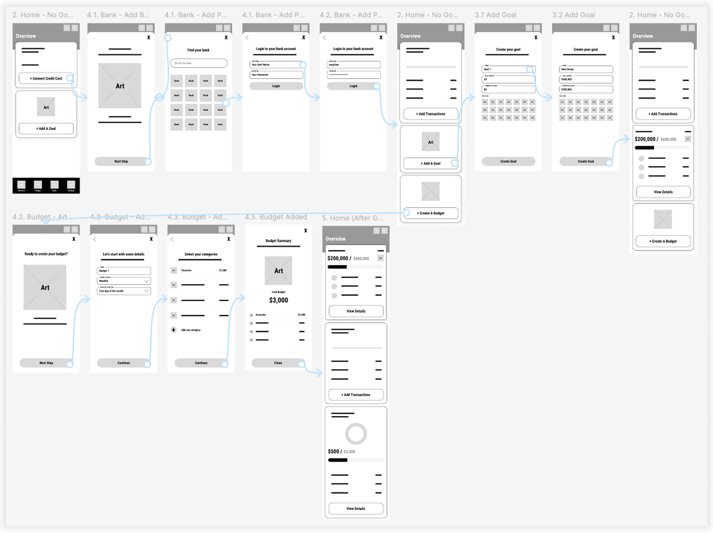
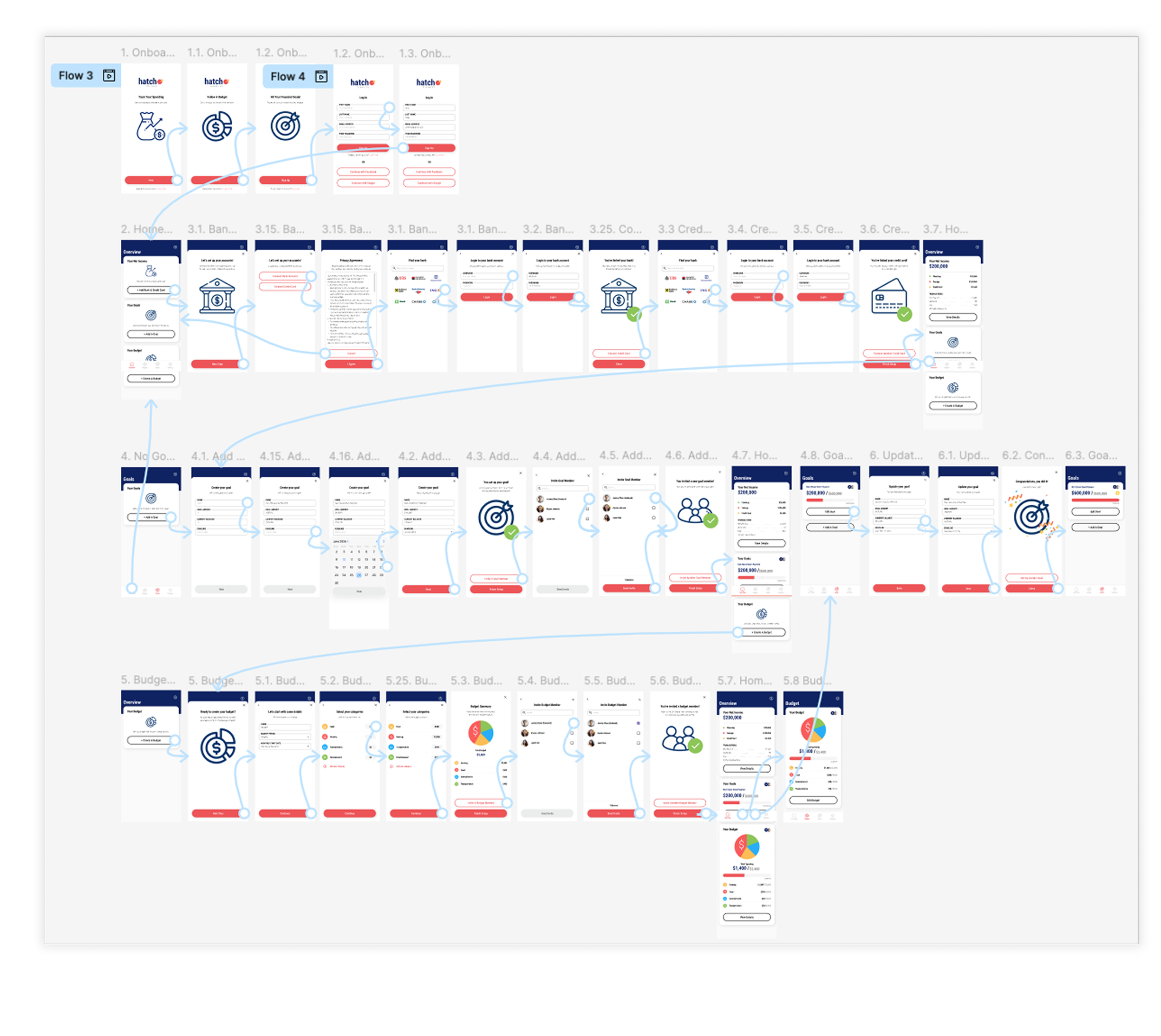
USER FLOW
The flow of Amy’s experience was laid out to help understand the steps she needs to take in order to achieve her final goal of hitting her financial goal.
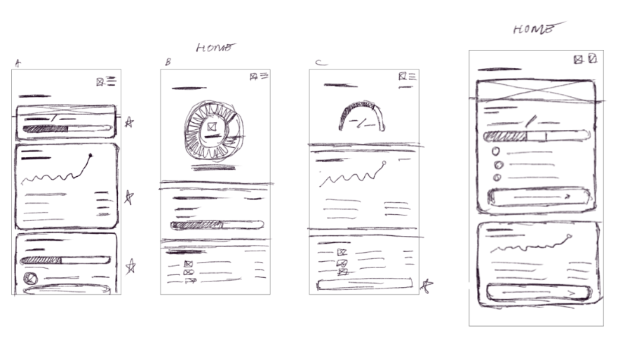
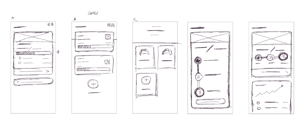
PAPER WIREFRAMES: HOME, GOALS, BUDGET
Sketching allowed for quick concepts and testing with potential users. I discovered the different ways some users prefer to see their financial data such as using bar graphs and pie charts.
One feedback was the graph options were too complicated, just a simple bar or pie chart is enough to visualize the data.
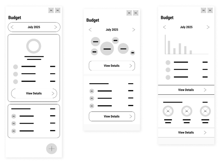
DIGITAL WIREFRAMES: HOME, GOALS, BUDGET
I also designed the digital versions of my paper wireframes to use in an initial usability study.
TEST
LOW-FIDELITY PROTOTYPE
A low-fidelity prototype was created from the user flow diagram to quickly test functionality before turning wireframes into mockups for the final design and to ensure accessibility for end-users.
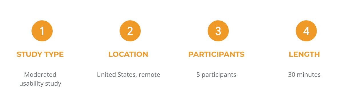
USABILITY STUDY PARAMETERS
USABILITY STUDY FINDINGS
After gathering key insights from the study, here are the findings and problems to be solved:
Round 1 Findings (Low-Fidelity Prototype):
Goals: Unnecessary elements to goal creation - complicates process
Bank: Connecting banks needs more sense of security
Budget: Hard to visualise money and data
Round 2 Findings (High-Fidelity Prototype):
Goals: Understand better how a goal is achieved
Bank: Still feel hesitant to connect bank
Budget: Prefer more budgeting categories
FINAL MOCKUPS & PROTOTYPE
Based on insights and patterns, the following design changes were made:
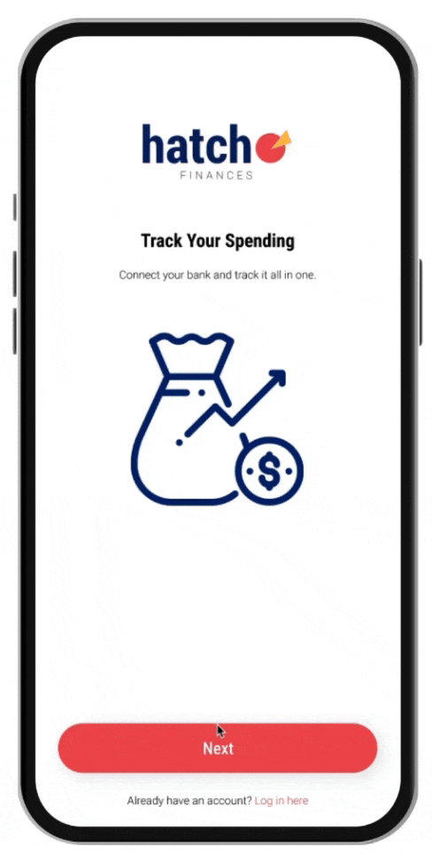
Home: Onboarding
Originally, I thought goals were the most important so it was placed first. However, users were a bit confused by the onboarding flow in which a bank and credit card needs to be connected first.
Changes: Rearranged the steps to make it more intuitive. Additionally, some tool tips would be good to include.
BEFORE USABILITY STUDY:
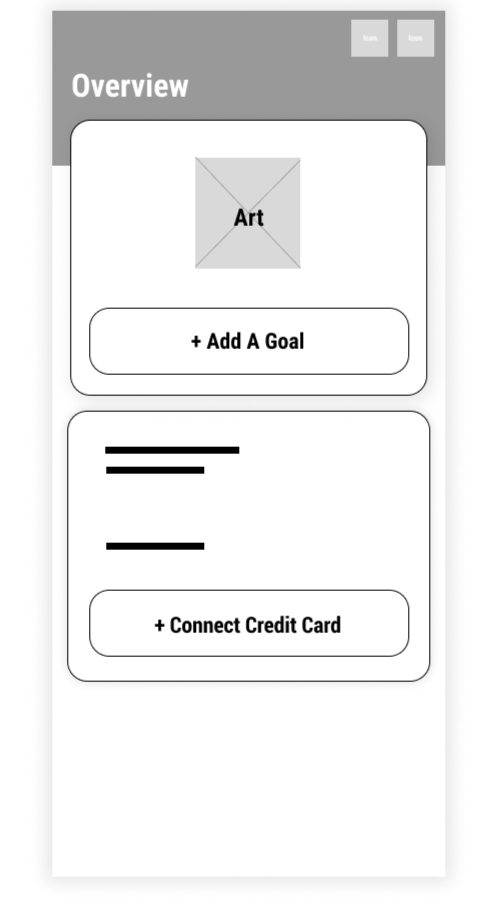
AFTER USABILITY STUDY:
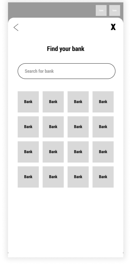
Connect Bank
When connecting the bank, users were skeptical about linking their bank account. There was also a progress bar but the steps were quite limited so it was unnecessary to include.
Changes: Privacy policy was included and progress bar removed.
BEFORE USABILITY STUDY:
AFTER USABILITY STUDY:
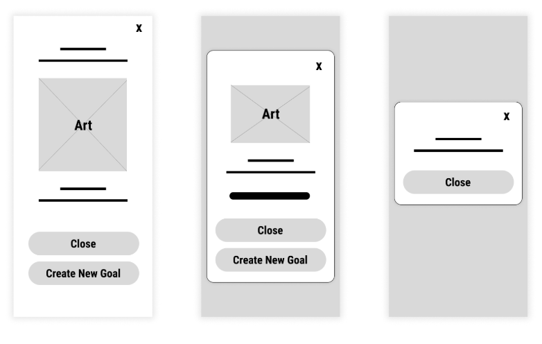
Create Goals
Users mentioned the picking of goal icons and option of adding a photo were unnecessary and didn’t add to their experience. They also wanted to set a deadline and invite their family members.
Changes: Removed icons and photo adding, added deadline option, and added member invitations to see data.
BEFORE USABILITY STUDY:

AFTER USABILITY STUDY:
Set Up A Budget
The budgeting process was smooth and users mentioned they wanted a pie chart for the summary screen as that was the easiest way to visualize the categories they had set.
Changes: Added a pie chart at the summary screen. Additionally, some tips on saving money would be good to include.
BEFORE USABILITY STUDY:

AFTER USABILITY STUDY:
Achieve Goal
Initially, there wasn’t too much testing on how a goal is achieved so there was a bit of confusion around that.
Changes: Added a way to update the goal and hit a major financial milestone.
BEFORE USABILITY STUDY:

AFTER USABILITY STUDY:
HIGH-FIDELITY PROTOTYPE
After finalizing the low-fidelity wireframes and conducting usability tests, I created the final designs and kept the flow simple and intuitive.
I designed a brand and sticker sheet that evoked a sense of trust and joy.

REFLECTION
Many potential users shared that they would love to use this simple app to track their financials with their family members. There was a lot of positive feedback on the visual elements of the app.
FURTHER IMPROVEMENTS
If I had room to improve:
Button colors: explore other options besides red accents as red can have negative connotations.
Improve consistency in the copy and content.
Get more feedback from designers in the field to improve the design.
Provide AI-driven personalized tips on saving money to users to make it easier for them to plan their budget and reach their financial goals.
Add in more options to create additional budgets and goals as some users may want to track more than one at a time.