MotionGrey (Redesign)
UX DESIGN + WEB DESIGN + VISUAL DESIGN + CONTENT DIRECTION
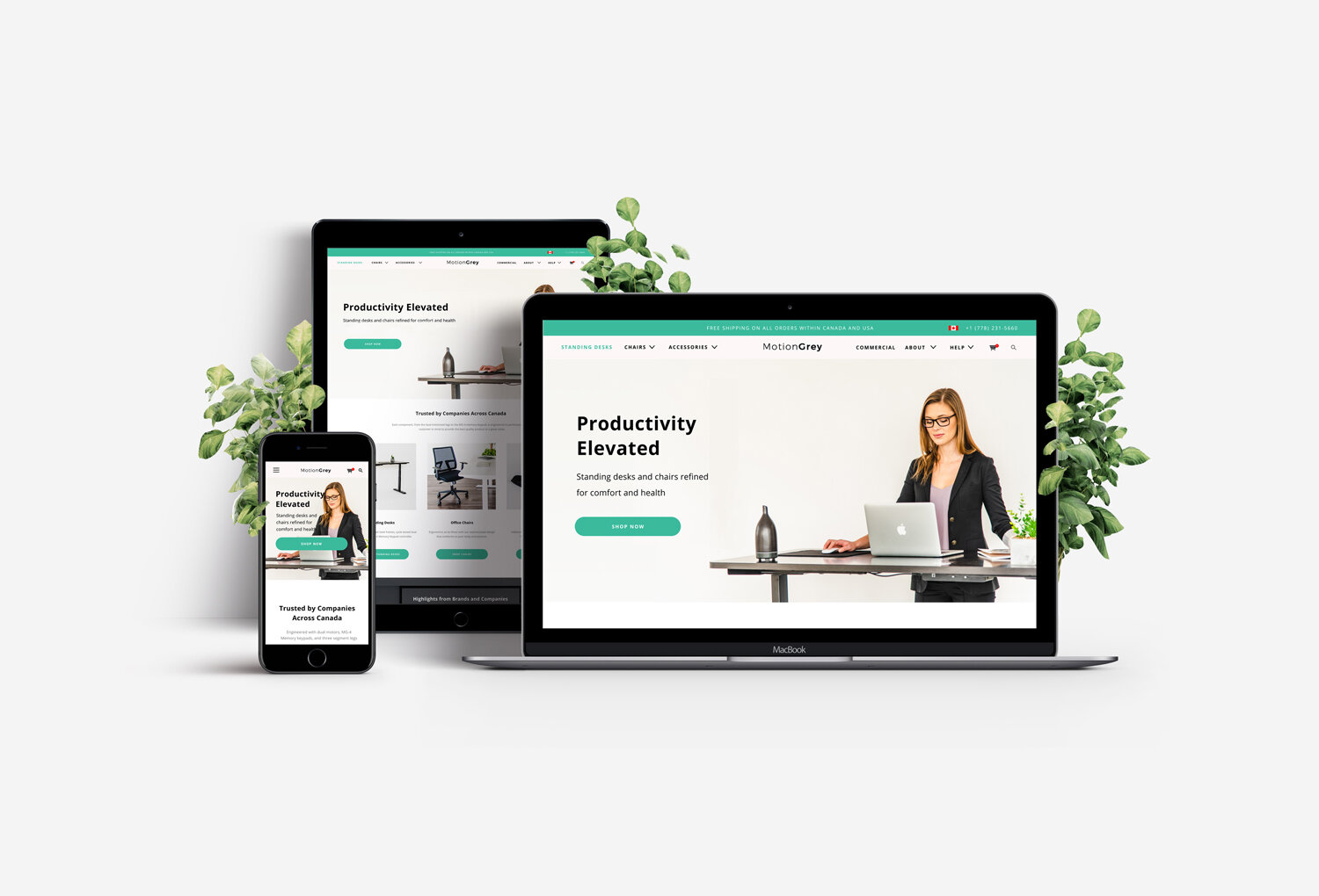
A digital experience redesign that refreshes the brand image and simplifies the shopping experience, while highlighting the craftsmanship of each product.
OVERVIEW
Roles: UX Designer, Web Designer, Visual Designer, Brand Strategist
Programs: Illustrator, Figma
Timeline: 4-Week eCommerce Website Redesign (March 2020)
Team: Founders, Web Developers, Graphic Designer, Marketer
Goal: Improve conversion rates and revenue via smoother shopping experience, reduce bounce rates, and refresh brand image to feel modern, health-conscious, and fun
Impact:
Customer retention increased from ~25% to ~50%
Conversion rates & sales revenue rose (exact numbers from this redesign)
Strong positive feedback from client and users about usability and modernized branding
Takeaways:
Simplifying navigation and optimizing mobile experience make a large difference in user satisfaction and retention
Branding consistency (style guide, visual cues) reinforces trust and mission alignment
Even small changes (color palette tweaks, edge-rounding, accent use) contribute noticeably to perceived modernity and friendliness
THE CLIENT
MotionGrey is a Vancouver based company with the mission of providing an ergonomic solution to everyday workspaces. MotionGrey’s vision is to create a suitable and healthy alternative to standard desks and chairs. The client wanted a new and modern eCommerce website design that showcases their high quality products and provides a better digital shopping experience. The end goal of this project was to increase their customer retention rate and store conversion rates. Upon completing the redesign, I kept in touch with the client to help them further optimize and provide recommendations on the Shopify experience.
BEFORE THE REDESIGN
The existing website worked on the browsing and purchasing aspects of the experience but it was missing a cohesive and modern brand image that reflected MotionGrey’s mission. The website was also not very optimized for mobile and missing a lot of crucial elements to make it easier for visitors to shop, thus, a lot of potential sales were lost.
THE V1 REDESIGN
THE PROBLEM
How might we make MotionGrey a smoother shopping experience while presenting the brand as modern, health-conscious, and fun?
PROJECT GOALS
Increase conversion rates and revenue through a smoother shopping experience
Optimize for both mobile and desktop and reduce bounce rates
Present an experience that reflects the brand’s new initiatives of being seen as modern, health-conscious, and fun
Working with the client, marketing, and development team, I designed an eCommerce website layout and seamless experience that was easy to navigate from browsing products to purchase.
I ensured every aspect of the site highlighted the client’s core products, kept the content clean, and allowed customers to make a purchase in simple steps. Both desktop and mobile experiences were considered and improved. I also gave a fresh look to MotionGrey’s brand that reflected their vision of being modern and innovative, and to stand out from their competitors.
THE PROCESS
Business & Competitor Research
I started the process off by developing a strong understanding of the client’s business more through in-depth discussion sessions. I wanted to dig deep into understanding their vision, mission, position, customers and situation. For the redesign, it was important to discover the reasons as to what wasn’t working well for the business and customers. A detailed understanding of the customers’ behaviours, preferences and goals also directed the design.
In determining the brand style for the redesign, competitive research was also a part of the process. I analyzed the websites, analytics, brand styles, content and messaging to see how to help MotionGrey differentiate themselves. The brand is also important to consider the target audience and what resonates with them. Some of the data referenced are the low conversion rates, drop offs on mobile, and high bounce rates from the original website.
Customer Research
I further tried to understand the customer base more and asked potential customers about their thoughts on the current website and what they would like to see.
The main customers include young working adults that are health conscious and looking for an affordable upgrade to their workspace for more comfort and customization. They also care a lot about quality and craftsmanship of the product.
Key pain points: the existing site was hard to navigate and find products, it was hard to understand the brand vision and what makes them stand out, and that the experience was not very optimized for mobile.
Style Guide & Site Map
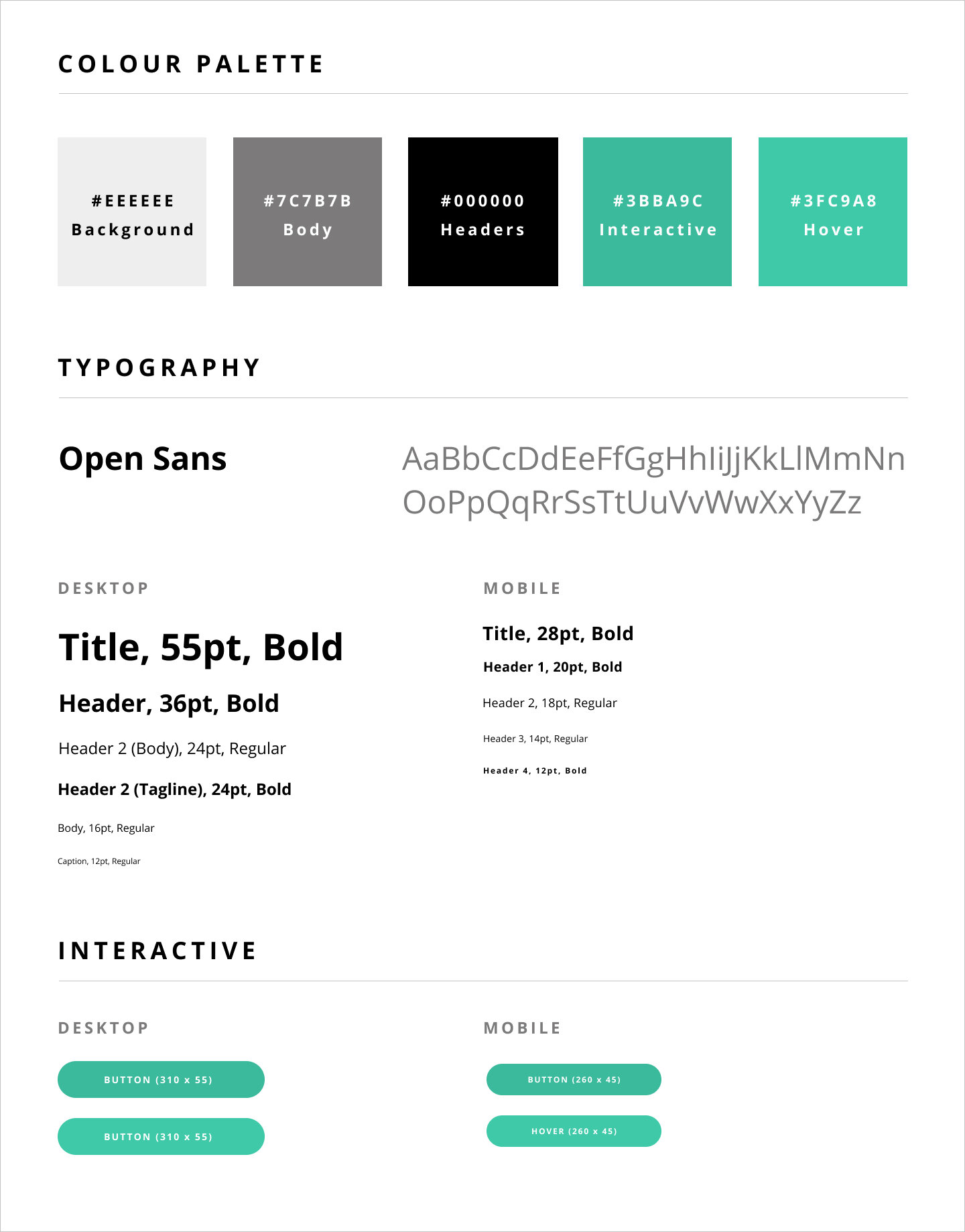
With my newfound knowledge, I crafted a style guide to direct the modern and clean style of the interface the client envisioned. The colours and typography were carefully selected as they were not only modern, but also reinforced the health aspect of MotionGrey's mission.
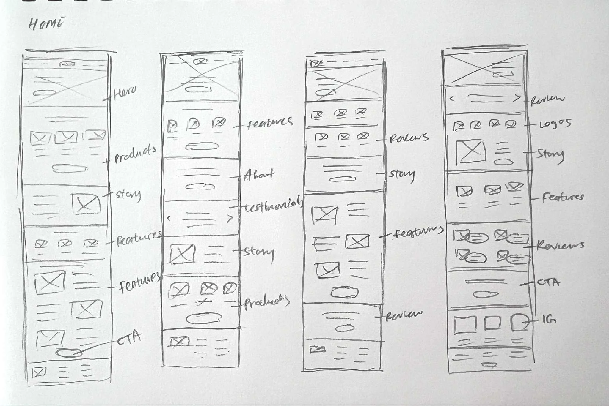
In understanding the variety of products and information to showcase, the site map was created. The site map outlined the overall structure of the site, with the objective of providing transparency and ensuring a clear and mutual understanding of the project.
From the site map, I created sketches and mockups that I reviewed with the team and gathered feedback from others. A prototype was put together to get a better sense of the overall experience. Many refinements were made on the shopping experience including browsing, customizing and payment. Below are some mockups from the desktop experience. In addition to the experience and interface, I also helped in directing the photography and copy.
THE UPGRADED SHOPPING EXPERIENCE (CORE CHANGES)
Key pain points: the existing site was hard to navigate and find products, it was hard to understand the brand vision and what makes them stand out, and that the experience was not very optimized for mobile.
Smoother Navigation: Navigation menu stands out more with a backdrop. Also careful consideration in the dropdown menus.
Easier Shopping: Add to Cart bar that would be fixed when the viewer scrolls past the Add to Cart button. Best for mobile experience.
More Customization: The customization interface is also very straightforward with better organization.
Smoother Checkout: In the cart and payment flow, a progress bar is shown so that the customer can get a sense of how long the process may take.
By making the experience more positive for customers on both desktop and mobile, MotionGrey is also able to capture more sales. Additionally, customers can learn more about the brand and build a connection to become a long term customer.
REFLECTION
MotionGrey was very happy with my work and I was glad to deliver a complete website redesign and refreshed brand look. The people I presented the prototype to was also fond of the improved experience and interface. The new look enhances MotionGrey’s overall brand image and quality of products with the aim to further encourage healthy lifestyles by promoting their ergonomic creations to a broader audience.
“Our team has worked starting working with Christy for the past year and it has been an unbelievable experience. Christy’s creativity and ability to go above and beyond the project scope has helped out our marketing efforts tremendously. Our customer retention rate metric across the board has increased from 25 to 50% after working with her team. Looking forward to working on more projects together, and would definitely recommend Christy to any business’s looking to expand on their brand/business strategy in the online space.”
FURTHER IMPROVEMENTS: V2 DESIGN
Since my last involvement in this project, I have been working exclusively with MotionGrey on further improvements on the website based on analytical data and customer feedback. Together, we took the brand further to stand out from the market and appeal to a younger working audience. We worked on touching up the colour palette for the brand to present a fresher look that wasn’t too present in the standing desk market. I also considered other visual elements such as the lines and shape of the button. Since MotionGrey’s desks had soft round edges, I wanted the visual elements to reflect that as well - the images and buttons have round edges.
Below is the improved palette and you can view the live design at motiongrey.com. Note that the development of the designs still needs improvement. The client is currently still generating high sales revenue after the minor adjustments.
The cool tones bring out the freshness and professionalism of the brand. The orange acts as a bright accent colour to give off a fun feel that the company envisions, while bringing attention to key actions within the online experience. Together, these colours work well in the eCommerce space.


