
Daily UI Challenge
UX & UI DESIGN + VISUAL DESIGN
To improve my UX and UI skills, I decided to start the Daily UI challenge (2018) that lasts for 100 days. Here, I will share some of my favourite designs throughout the challenge! I am passionate about designing simple, elegant, and unique interfaces. I also aim to incorporate some of my knowledge in web analytics as well. The design of the interface elements, from icons to illustrations, are mostly by me. See below for all the designs I’ve made so far.


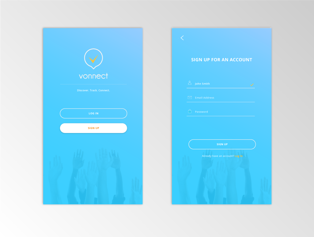
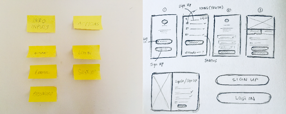
001 - SIGN UP
As I have designed sign up forms a few times already, I have some experience with them. For this one, I wanted to follow a volunteer opportunity app theme that was vibrant and attractive for young people. I looked for inspiration from other designers on Medium.

Blue - final design
The challenge allowed me to practice quick but considerate decision making. I wrote down the main information and actions needed to sign up, keeping them as simple as possible. At first, I used the labels "Sign In" and "Sign Up" but then from first glance, it may confuse the user, therefore, I used "Log In" instead. I wanted to add in both icons and labels to make it more appealing and easy to understand the information needed. Icons would be helpful especially for an international audience as well, reflecting my values of diversity and accessibility.
In the rough sketches below, I explored several other interface layout options. However, for simplicity, especially with such a first and crucial step of interaction, I decided, along with feedback, to follow the first layout (#1). If people get frustrated with this step, they may close or remove the app. I later tested this quick prototype and received positive feedback from my peers.

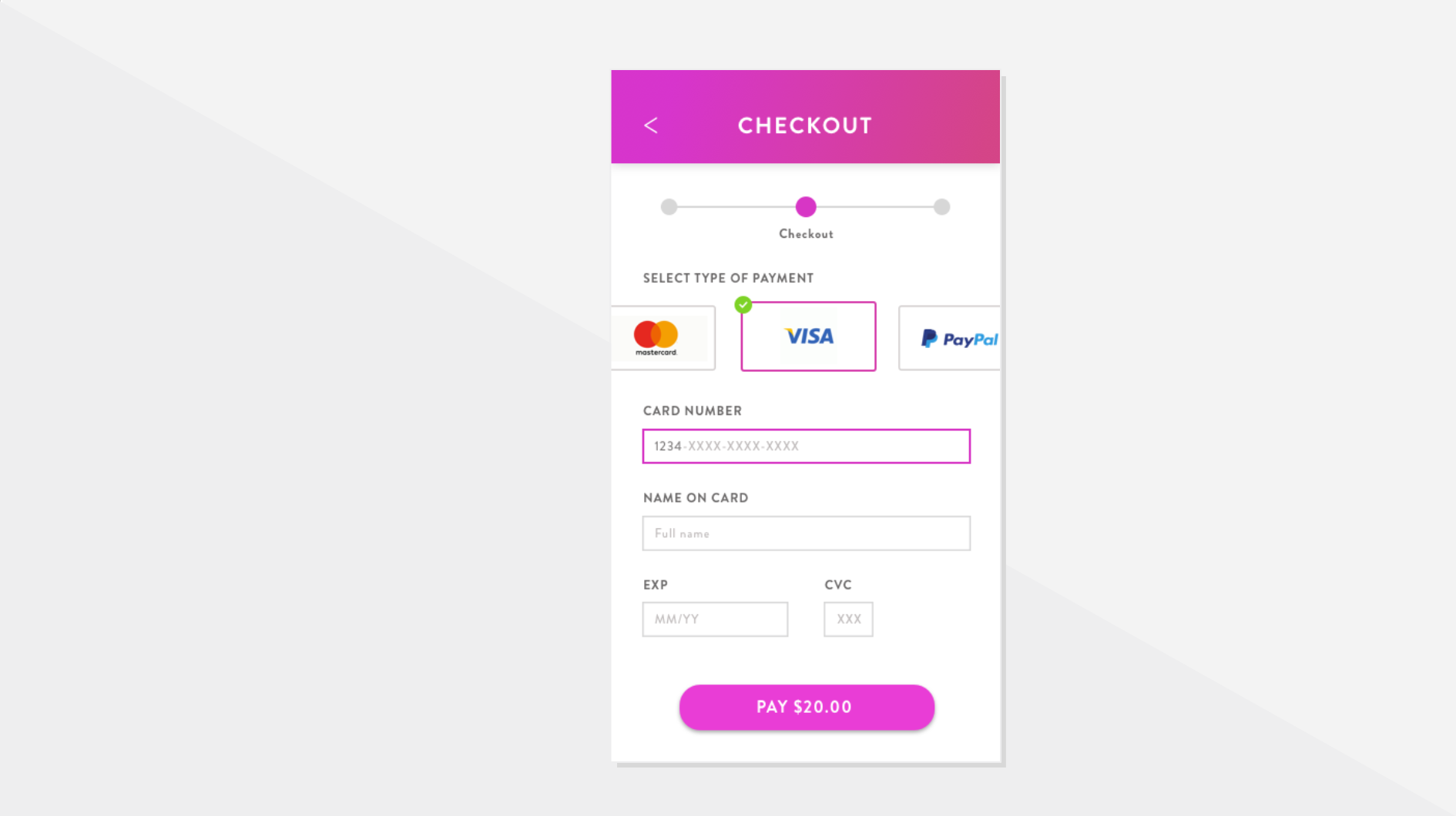
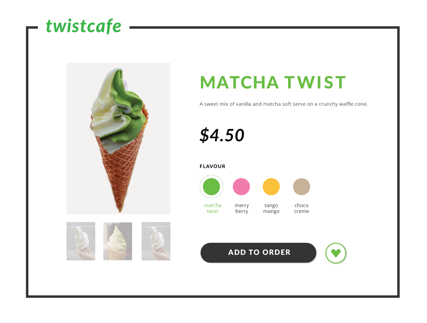
002 - CREDIT CARD CHECKOUT
I really appreciated that Daily UI gave me this challenge after the weekend on purpose. They wanted subscribers to enjoy the outdoors! It was really a small memorable moment for me. For this challenge, I usually pay on desktop instead of mobile, so I was quite unfamiliar with this type of UI. I did some research and tried out some shopping apps, sketching out my layout ideas along the way. I decided to aim for a colour on white since making payments is a sensitive task and I wanted people to feel secure. The colour scheme gives off a clean and transparent look. Instead of using Illustrator, I used Sketch this time as practice.

Again, I asked some of my friends what were some pain points with payments before ideating. They mentioned about not knowing which step they are at, having to fill in too much info, and dealing with messy forms. I took all that into consideration and did a few sketches. I really liked the last one since it showed the steps, clear text boxes, and the user can remember exactly how much to pay without going back to their cart.

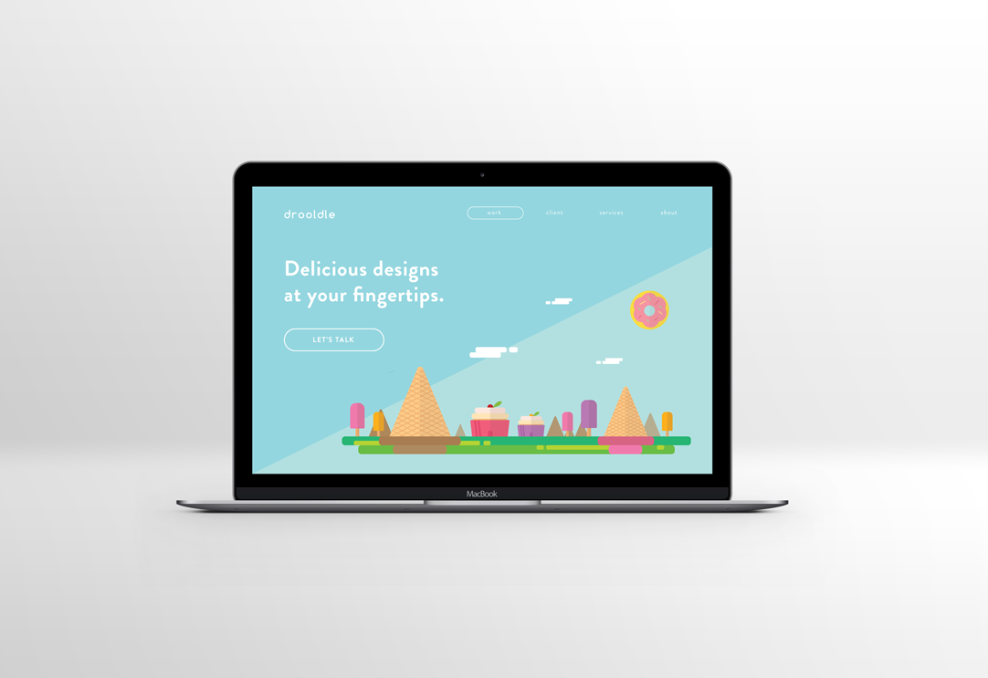
003 - LANDING PAGE
I decided to practice doing flat design illustrations and spent a little too long on this page. It was fun though! Landing pages should showcase your story, product, or service as it is what shows up first for the viewers. You want to give a good impression, provide enough information, and draw them into seeing more. This could help with capturing leads if that is the goal and decrease bounces (entering and exiting right away). An improvement I could make with this design is to add more of a description to make use of the opening screen real estate.


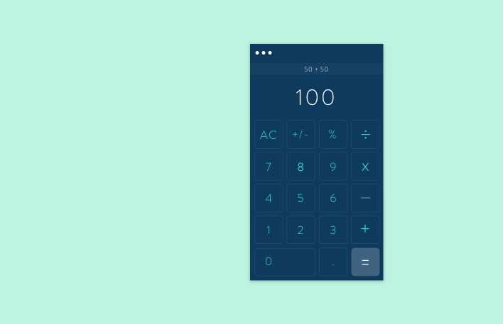
004 - CALCULATOR
I have never designed a calculator interface before so this was exciting. Having so many numbers on the screen can be daunting. I wanted to test a different shape - rounded rectangles instead for the buttons. I also wanted to try out different colour styles - more gradient ones to make the calculator experience more joyful. The main considerations were the colour contrast, button sizes, and font sizes

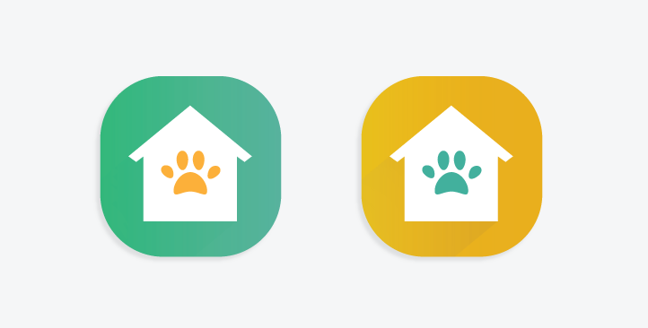
005 - APP ICON
I have always wanted to design an icon for an adoption app. I used a more flat design approach with contrasting colours. At first I only used the turquoise colour since green is often associated with positivity and action in most cultures. But then I felt that adoption should give off a warm feeling too, so I used orange as an accent colour. The main considerations were the colour contrast, shape sizes, and spacing. The shapes should also be simple enough so that they can be shrunk down to smaller icon sizes without distortion.


006 - USER PROFILE
For this day, I decided to remake an interface from a previous project, Bud-dy. I made it more appealing and allowed for more customization. The main consideration of this challenge is the sizing of the profile image, cover photo, text, and buttons. The content that covers the rest of the page should also present the info that people would like to see first.
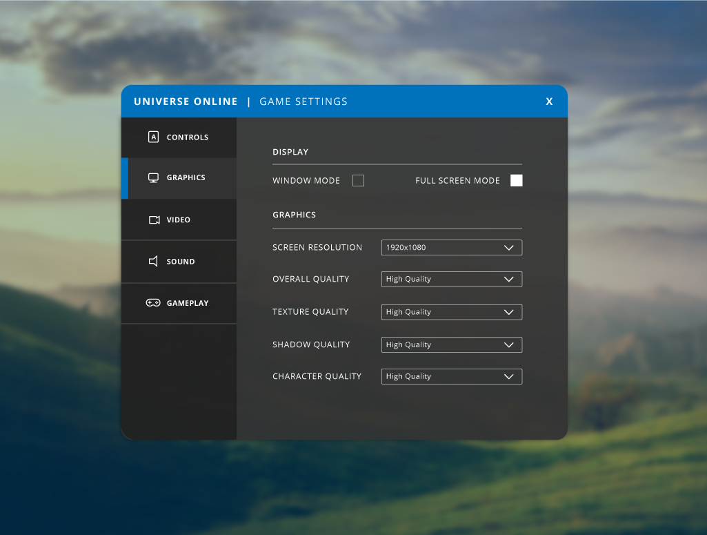
007 - SETTINGS
Initially, I was going to go for a typical profile setting UI. However, I remembered how I admired some of the UI in video/online games such as some parts of Overwatch, so I decided to design game settings. In this challenge, I had trouble considering how to organize the menu and main options. I had to research into the typical settings for games. I opted for a drop down instead of the previous/next selection option. I asked my fellow gamer friends who said a drop down is faster for them to choose settings and they can see all options at once too.

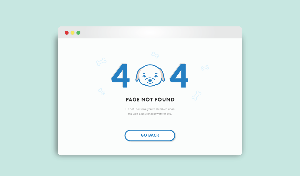
008 - 404 PAGE
Never made one of these before but really wanted to have some fun with it! The important part is making sure that people can have a positive experience even if it's supposedly a negative one. The inspiration behind this was that I was with my bestie at the moment and we were having lots of fun playing with her dog.

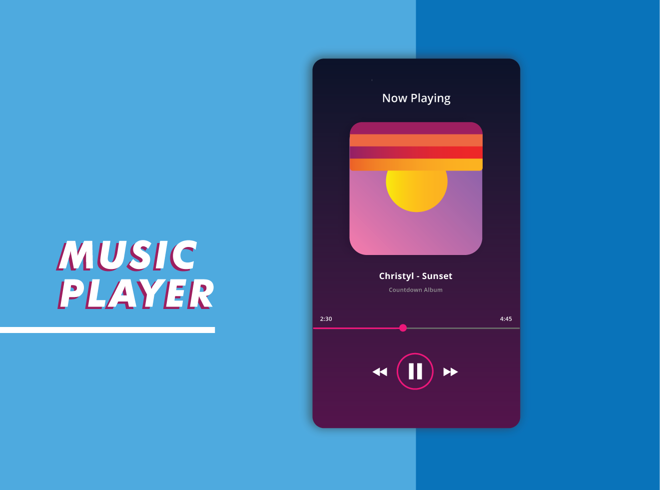
009 - MUSIC PLAYER
I love to listen to music so I had fun with this design. A few decisions I made were to put the timestamp on the top of the bar instead of below. This is so that if the user were to want to skip to another part of the song, they could see the time change clearly without their finger in the way.

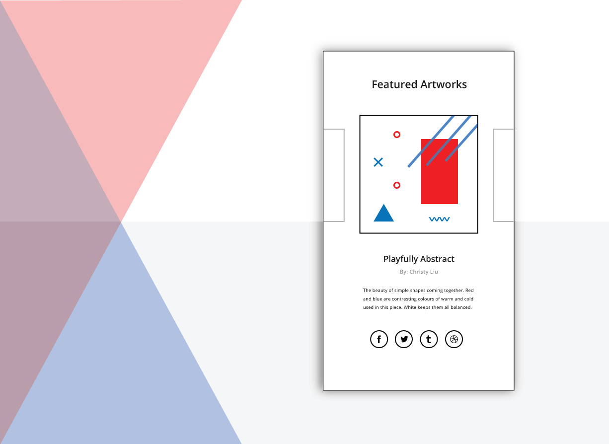
010 - SOCIAL SHARE
I kept this design simple and showed the buttons for sharing pieces of artwork. The sizing of the buttons, colours, and spacing were the main considerations.

011 - STATUS
I wanted to play around with the imagery and wording of errors and success status pop-ups. Friends that I showed this too really liked seeing the faces on there.

012 - PRODUCT PAGE
This was done pretty late as I was getting busy from school courses! In this design, I considered which info were the most relevant (name, price, image, description) and the actions needed (add to cart, like/add to wishlist). I could have included different views of the product as people may wonder what the inside or back looks like. This would help enhance the online experience of a product. (Image from Paperchase)

013 - MESSENGER
I took a look at existing messaging platforms and opted for a more simple look. The main tasks for this casual messaging app (for dogs) are to search up conversations, click into a conversation, and then view and message. The colour choices were also important, especially within a conversation. It is important to provide enough contrast for viewers to distinguish quickly between their messages and the other person's. I also wanted to make the feeling of "speaking" more realistic by ensuring the point on the speech bubble was there. I like to pick on small elements within an experience to focus on as I believe that every detail can make a difference.

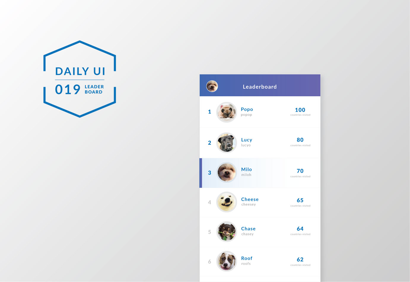
019 - LEADERBOARD
I have been practicing a few smaller UI tasks and this was one of the more complicated ones. This is my second time making a leaderboard, and again, the spacing, hierarchy, and contrasts of elements were the most important. I could have improved this more by making the highlight more vibrant to congratulate the user if they were at a high position.

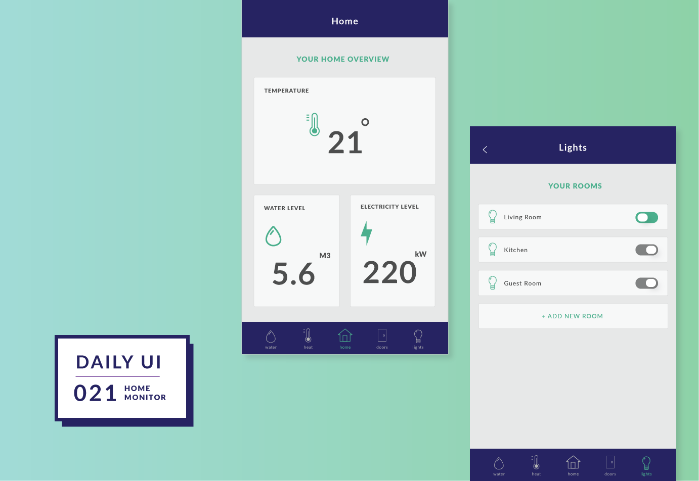
021 - HOME MONITOR
This was quite a complex interface to design and I really had to narrow it down to what the user needs would be. I asked around on what people's goals would be with this type of app. The main ones were to see an overview of the condition of their home and to turn statuses on and off. A few design decisions I had to make were whether to use visuals or not and whether to do a web app or mobile app. I initially had several visuals (see image below) but it was hard to balance the elements without it being too distracting. I also didn't want to use circle graphs as it may not be as intuitive to read as bar graphs. Also, I opted with mobile app instead since my interviewees mentioned they would likely use this type of app while on-the-go.

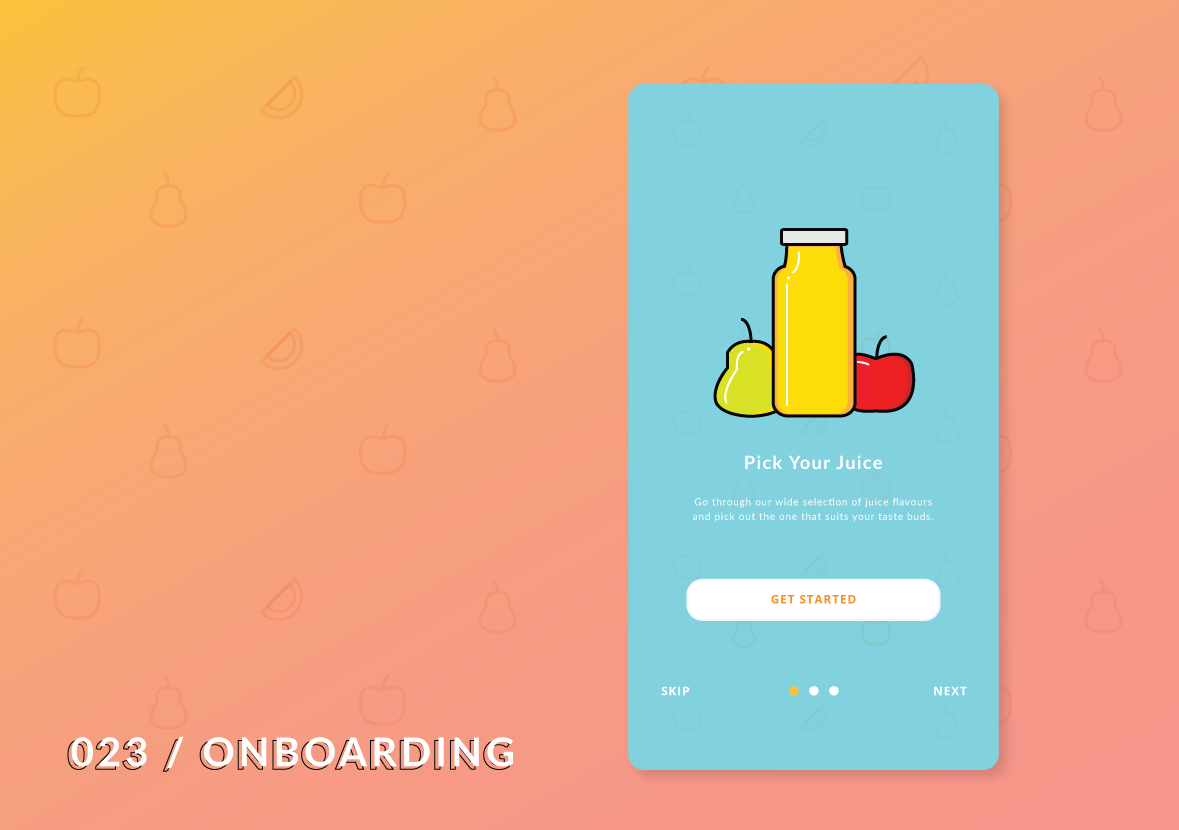
023 - ONBOARDING HINT
I have designed onboarding UIs before and here is what I have for this day. I considered the main tasks needed: next, skipping a step, and getting started right away. I used headers, descriptions, visuals, and a progress bar to help the user understand each step of the onboarding. Onboarding is important in showing the main features of the app. This can be helpful if the user is new but annoying if they are returning (so we need the skip button). I later realized the skip button should be placed beneath the progress bar so there can be a "back" option on the left instead.

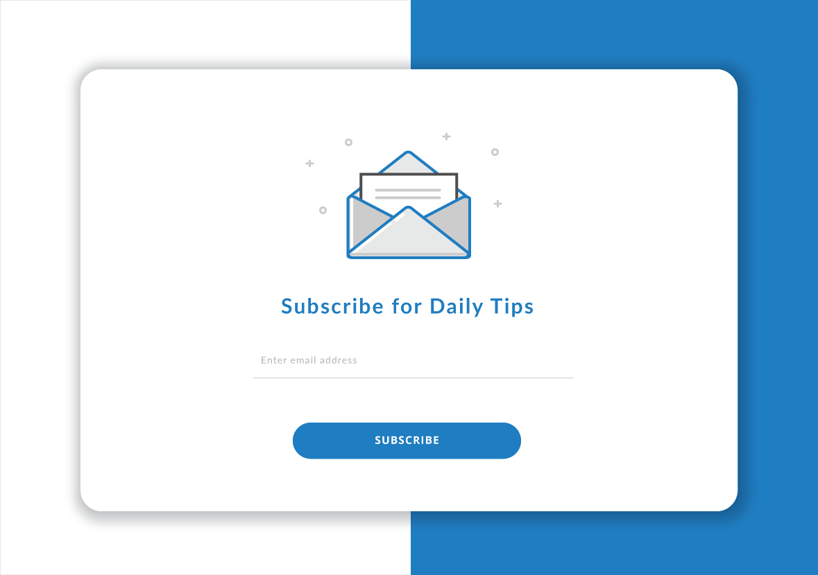
027 - SUBSCRIBE
First time designing a subscription UI! The main parts were the info needed such as email address and pressing subscribe button. Before subscribing, it would be nice for the person to know what they're getting (people don't want spam!). Making the subscription experience as simple and quick as possible will attract more people to subscribe to the mailing list.

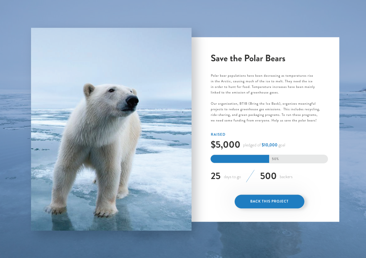
032 - CROWDFUNDING
Instead of doing an interface for a product, I decided to go for a meaningful cause. In this challenge, I try to push myself to design for various use cases. For crowdfunding interfaces, the goal is to raise awareness and gain a lot of backers. The image used should be compelling, there should be a story behind the project, the goal, the current status, and a clear call-to-action. The progress bar helps people visualize the current status of the project and motivate them to help increase it. (Photo from Mashable)
033 - CUSTOMIZE PRODUCT
When it comes to customizing products, I think of Nike. This was similar to Day 12 Product Page except I added in a way to select a different colour. Additional customization options could be sizing or toppings.

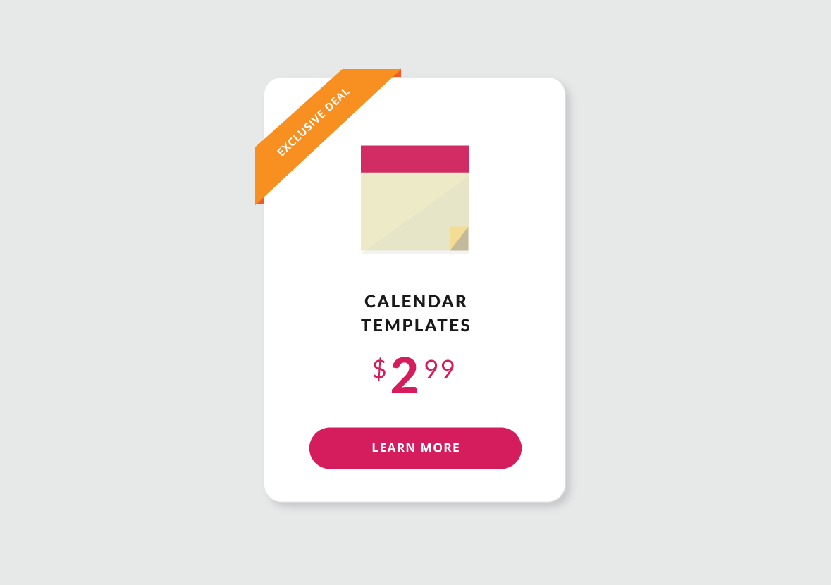
036 - SPECIAL OFFER HINT
Similar to the previous challenge, this one was also about making the offer seem interesting. A price would be good to include as well as a list of features. The button would be another element to consider as well. I kept this design more simple and made sure the "exclusive deal" element was eye-catching.

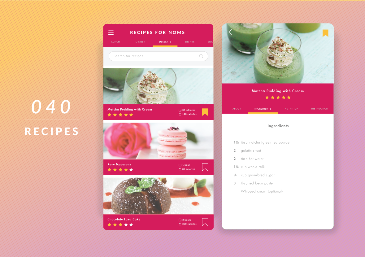
040 - RECIPES
Today my friend and I made matcha pudding so this was inspired by that. Recipe interfaces are tough as there is a lot of content to put in and categories. I tried to organize based on breakfast, lunch, dinner, etc. as well as allowing for searches. I asked potential users and they mentioned that they would like to see preparation time, calories, and ratings to help them narrow their choices. The images I chose were clear and emphasized the dish's features to ensure that the experience is smooth and pleasurable. I didn't want all the information on the recipe to be all in one section when you click into it so I categorized them as well. (Recipe from Just One Cook Book, images from Sarah Steiger and Patisse)

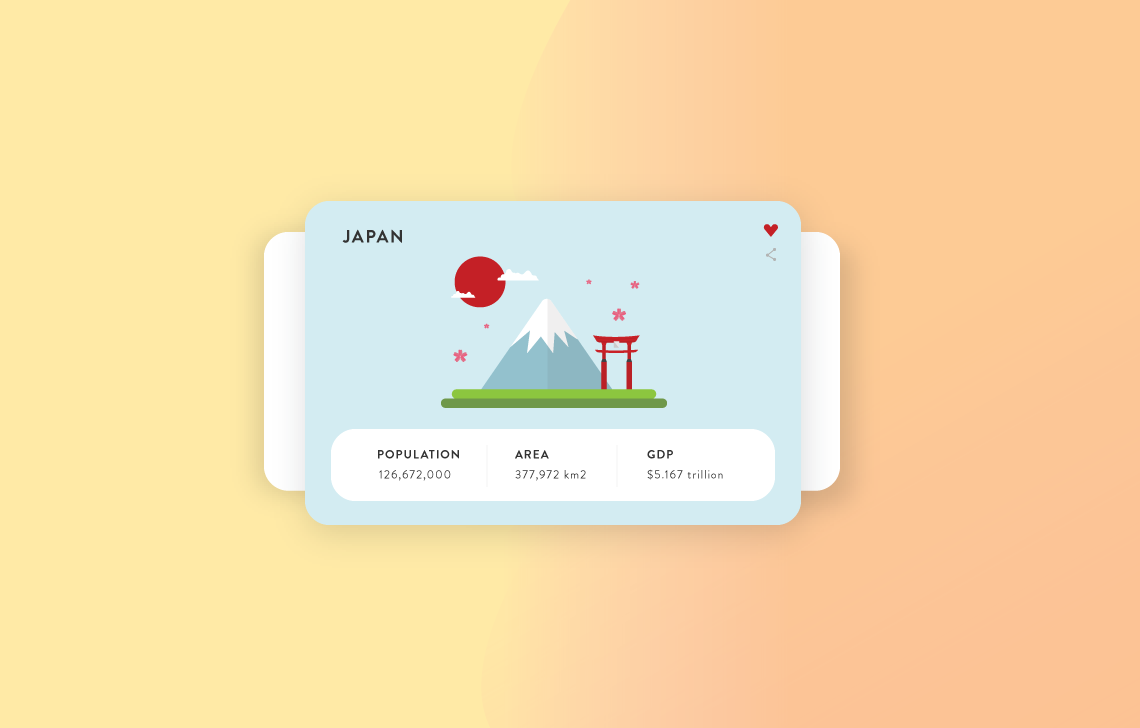
045 - INFO CARD
I wanted to get creative with this one and push my flat illustration skills as well. I recently travelled to Osaka, Japan and loved it there! I wanted to make an info card as a way of remembering my time there. I spent about 2 hours on the illustration on Illustrator. Then I created the card UI for Japan including the characteristics of it based on Wikipedia. The design was inspired by another post on Dribbble. I loved the outcome of it and proud to have it as my latest work. (Illustration inspiration)

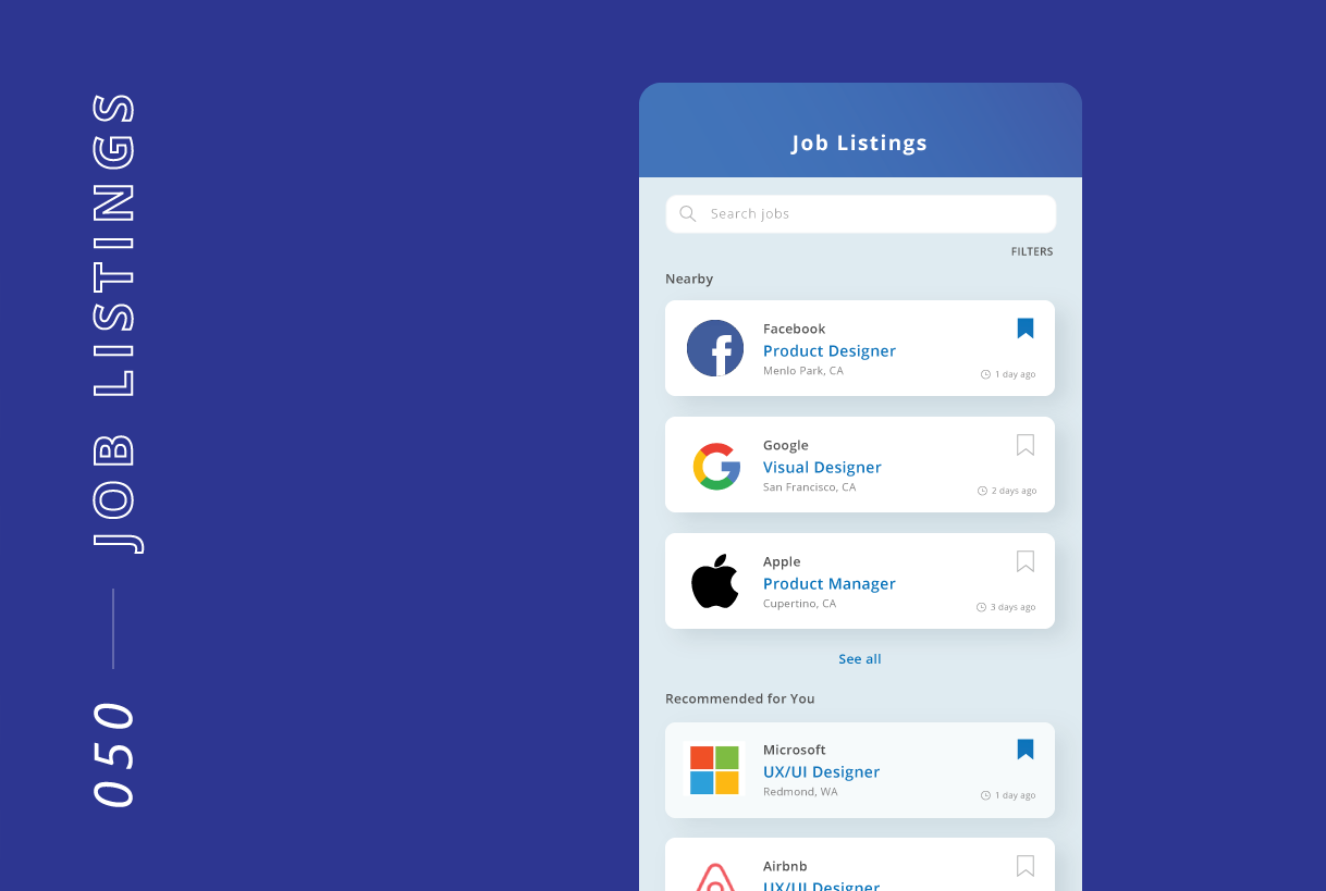
050 - JOB LISTINGS
The most important parts of looking for jobs are seeing the company, position, and location up front. I included the time posted in case people want to see how long it has been out for. Also, it is good to allow for bookmarking as some people may want to save it for later reference. I kept the interface as simple as possible, free from distractions, and considered the image and font sizes given that there is so much information to show. If I had more time with this challenge, I would further develop the filtering options as well as the look of the job description when tapped.

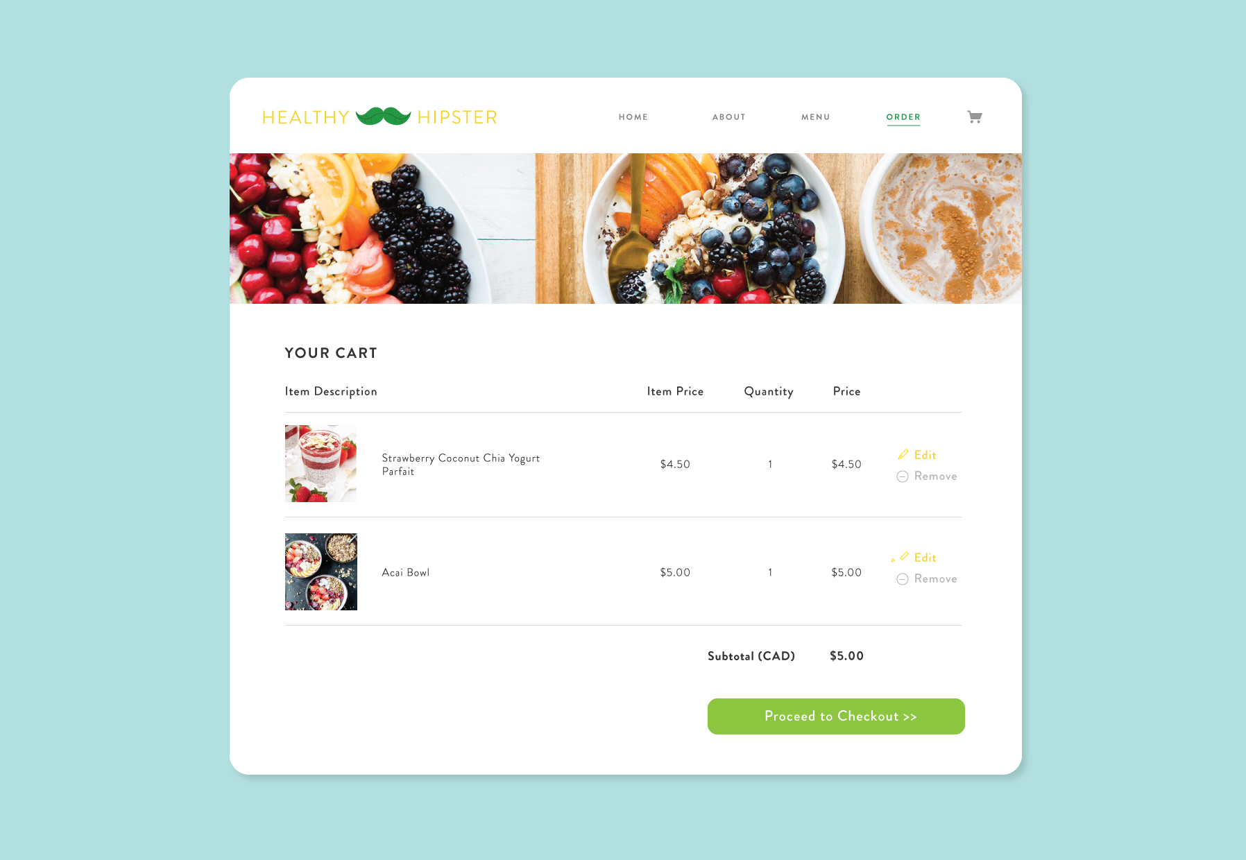
058 - SHOPPING CART
The previous challenges were rather minor compared to this one. This one had a lot involved with the checkout process. I wanted to recreate a previous website I worked on for a web development course. The website was for purchasing healthy food online such as parfaits, juices, and bowls. Here is the checkout process I put together.
To improve the previous layout, I started off with studying current shopping sites such as Nike and Aldo. Then I asked people what they would want to see in the shopping cart page. Next I put stickies of tasks and goals (see below - pink dots represent interactions). Then, I sketched out ways to lay the content. I reviewed it with potential users and they thought it was straightforward. Overall, the hard part of this is how to lay out the products and relevant details so the user can see all they need in one view. It is one of the first steps in the checkout process and it is important to make it as simple and easy to understand as possible. This will help bring the customer to the next step of the purchase and increase the chances of them returning.

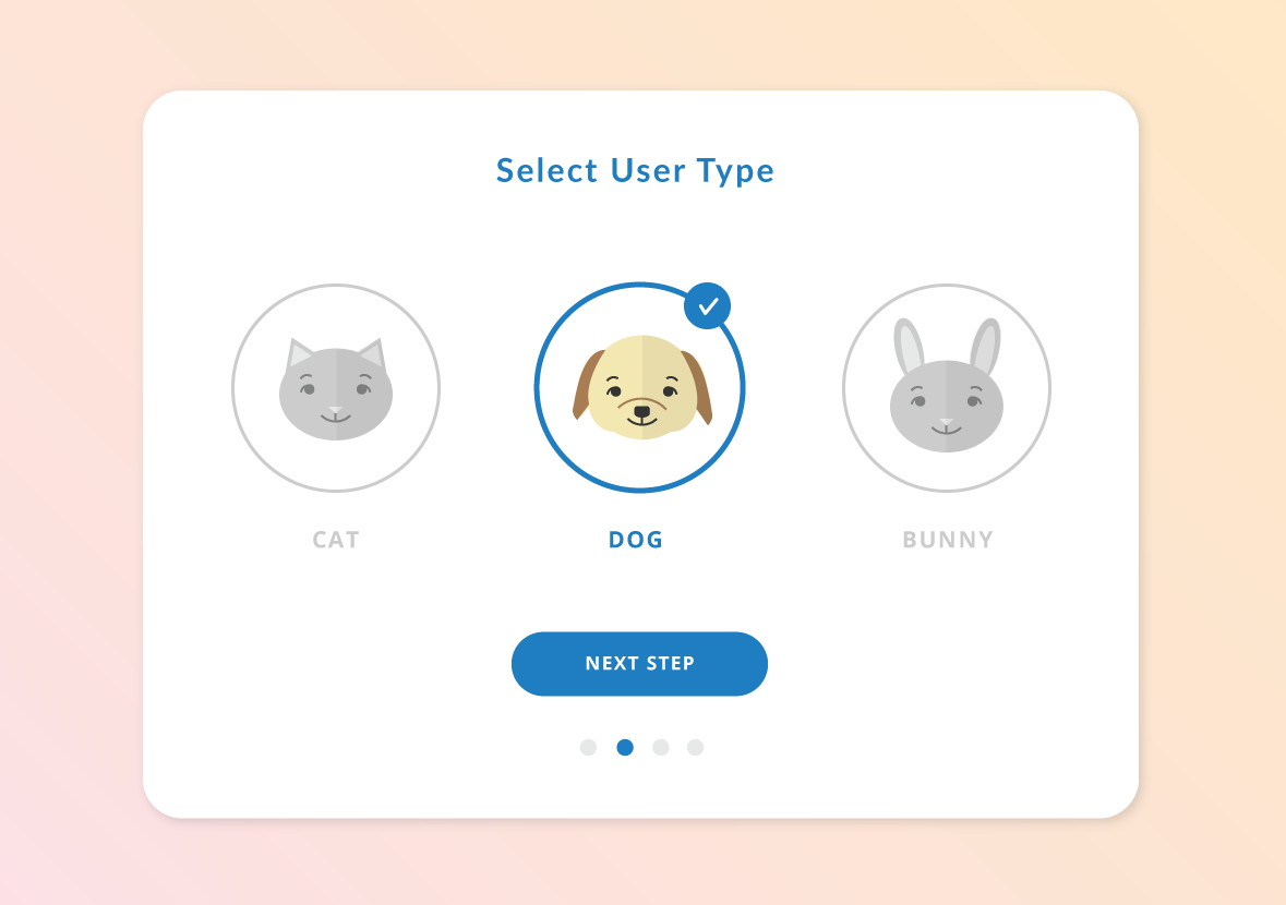
064 - USER TYPE
Had fun with this one again and mostly included several options, button to proceed and a progress indicator. Including icons makes it more interesting and easy to notice right away. To improve, I could include a short line of description for each of the user types.

065 - NOTES
Trying to challenge myself harder to learn more, I used proto.io to create interactive mockups. For the interface, I considered providing options to create folders for notes and search for them too.
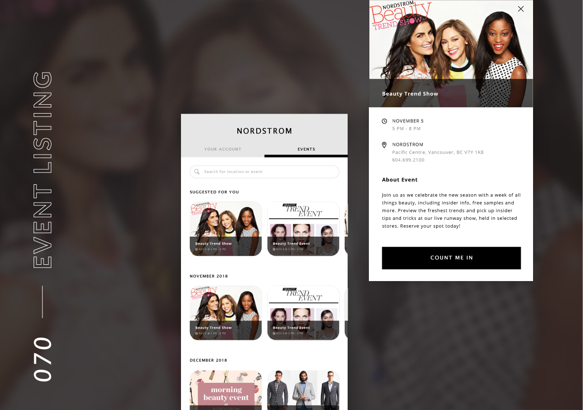
070 - EVENT LISTING
I wanted to go back to a design I did about 2 years ago for a Nordstrom project and make that better. I started off brainstorming the main tasks (green stickies) and information (pink stickies) needed for this interface challenge. I then sketched out various layouts and made some low-fi mockups on Illustrator. After that, I asked around for feedback on the layouts. I chose the layout for my final design since I wanted to make each event easy to find and stand out. I looked at listing apps such as Airbnb and Eventbrite for inspiration. Throughout the designs, I made sure to bring in the brand's elements such as excitement and glamour.

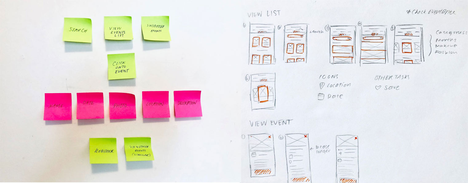
Process

Low-fi mockups
071 - SCHEDULE
In making the schedule interface, I had to consider what were the main elements of importance for the user. That includes date, time, tasks, colour-coordination and ability to edit or add new tasks. I also considered information hierarchy in which the times that have passed would be grayed out.

074 - DOWNLOAD APP
For this challenge, I used one of my app projects that I did. In designing the website layout, it is important to keep it simple and straightforward. This includes a catchy title upfront with a short description of the app and buttons for downloading. Also, there should be a button throughout the site (top right) on the navigation. This will encourage app downloads.


081 - STATUS UPDATE

088 - AVATAR
093 - SPLASH SCREEN
The challenge of this was deciding what to put on the first screen people see of your app. The logo, the description and the action buttons were the main parts to consider. The illustration and colour choices also give an important first impression.

100 - DAILY UI PAGE REDESIGN
The very last challenge was to redesign Daily UI’s landing page. At first look, their original page was very simple. It would have been nice to see a showcase of people’s work to inspire more to join. The description was straightforward but I thought it could be highlighted more with a short list. As one of the main call-to-actions on this page is for people to subscribe, I made sure the email address input area and button to subscribe was easy to spot.


REFLECTION
After completing the 100-day challenge, I feel much more familiar with the latest design styles and experiences. I can definitely see that my colour and font choices have improved. There are so many ways to arrange elements on an interface and it is important to take into consideration the overall experience. I really appreciate the existing resources out there and the inspiration from other great designers. I have many more that are not shown here to keep this page from being too overwhelming. There are some challenges that I’d like to go back and improve as well. Stay tuned!