
Monkiri (Redesign)
PRODUCT DESIGN + VISUAL DESIGN
Simplifying visual elements and integrating personalizations through AI to facilitate learning, while bringing in moments of delight in the learning process.
Project Type: V2: 6-Month Startup Role - Complete Redesign Of Mobile App & Learning Management System (January 202
Project Type: V1: 1-Week Mobile App MVP Redesign Project (March 2019-2021)
Team Members: Founder, Product Manager, Software Developers, User Researcher, Content Creators, Data Analyst
My Roles: Product Design, Visual Design, Branding
Programs: Illustrator, Figma, InVision
Results: Secured funding from organizations with the first MVP redesign followed by 150+ downloads and active users as of 2020, a majority of positive feedback from users (learners) on the latest redesign concepts
THE PROBLEM
How might we make financial concepts more accessible and easier to digest?
THE SOLUTION: LATEST DESIGN (V2) - ON ANDROID FOR SOUTHEAST ASIAN & CANADIAN LEARNERS

Monkiri is an AI-powered mobile e-learning platform focusing on financial literacy and inclusion. The platform aims to help people, especially those from emerging economies, learn about core financial concepts and make it easier for them to connect with relevant financial service providers.
Monkiri realizes that 70% of people in emerging economies don’t know the rules because they lack the understanding of the essential concepts. Without being able to understanding the concepts, it means that over 2 billion people are excluded from financial services.
In March 2019, as a UX/UI Designer, I helped redesign the current (Android) interface and experience for the MVP based on user feedback from testing. I also aimed to establish and integrate the overall brand look into the experience. As most people in emerging economies are not too familiar with tech, apps and English, I had to keep that in mind and use icons as well (which I recreated). I took on the opportunity to design on the team as it was a meaningful initiative for me in helping those in need.
As of March 2020, the app has hundreds of downloads and active users within Southeast Asia (Cambodia, Myanmar, Phnom Pehn) and Canada.
PREVIOUS DESIGN MOCKUPS (V1)
The previous designs showcase the intention to help people learn about core financial concepts and connect with relevant financial service providers. There was also a big focus on making the learning experience fun.

Previous redesign V1 of the main interfaces from the course experience to exploring financial service providers (2019)
In March 2020, as a Product Designer, I was hired for a 6-month full time contract on the team to further redesign the mobile app based on the user testing gathered. We needed to make the app appeal to both youth and adults, as well as consider the usability for American and international markets.
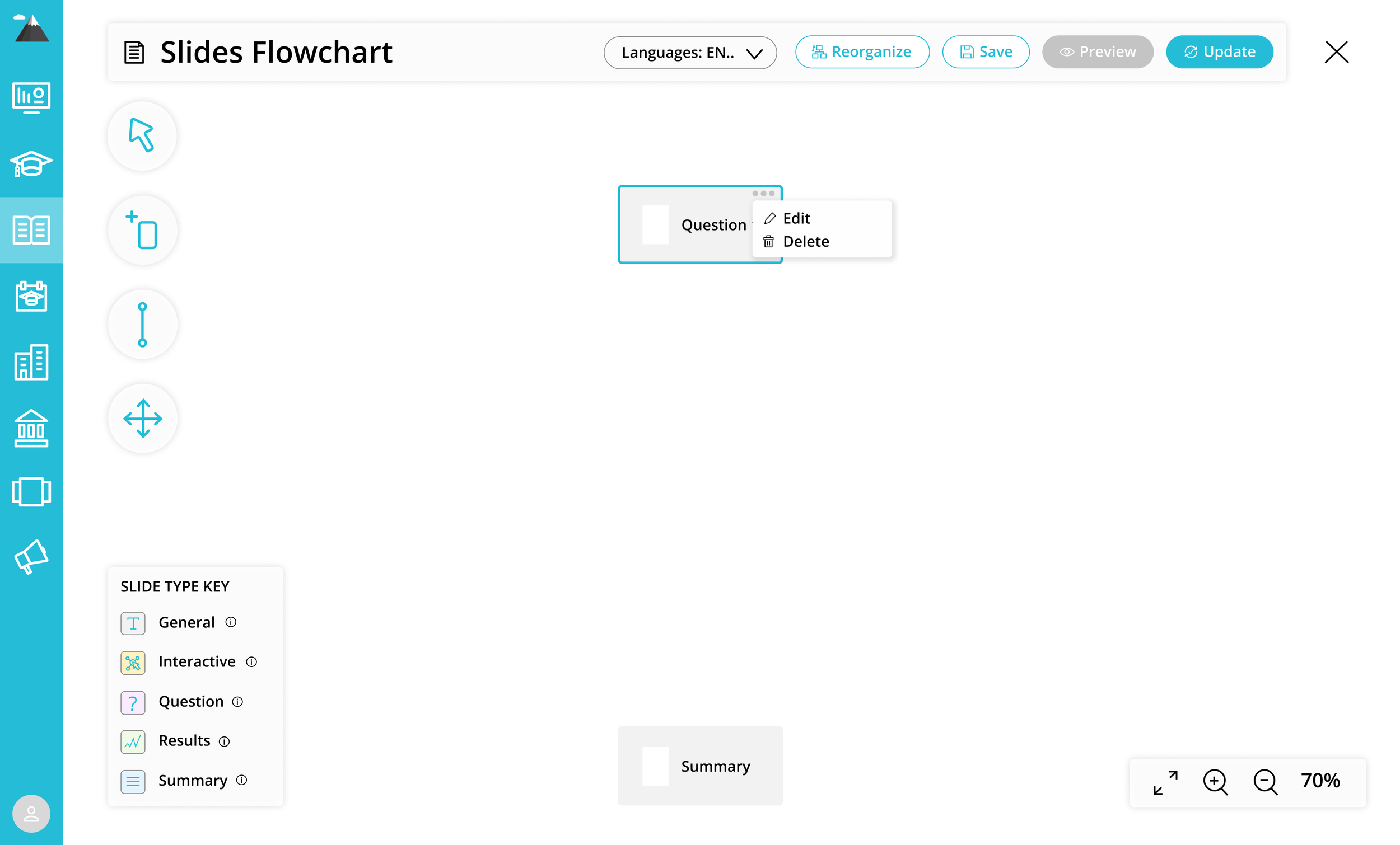
LEARNING MANAGEMENT SYSTEM BACKEND FOR CONTENT PARTNERS
I also redesigned the Learning Management System to allow content creators and our partners to easily add and manage lessons and students. It was a very complicated process and a lot to consider and implement after rounds of research and user testing. I was heavily involved in building the informational architecture for multiple use cases, as well as the entire design system and style guide.

Learning Management System redesign for our content partners to build content on the app (2021)
THE V1 INITIAL PROCESS (1 WEEK)
PERSONA: KIRY (ADAM)
With only one week to redesign the existing UX and UI for our MVP, I started off with building out the persona. The founder had previously had a target audience in mind through user interviews while he was abroad in Myanmar, but I insisted that we should have an actual persona laid out to visualize exactly who we are designing for. Here is the persona I put together based on his in-person findings and further research.

Our persona, Kiry (Adam)
KEY OBJECTIVES
In designing for emerging economies, there were 3 key objectives:
Simplifying Concepts
Making Learning Fun
Connecting To Financial Services
I was aware of some of the constraints and pain points from the user base such as having limited experience with technology, limited levels of English, and having only older devices. So I had to design with more visuals, colour contrast, and keeping the user flows as simple as possible. I also had to consider the different meaning of colours and icons.
INTERACTION MAP
With the feedback we received from our previous prototype, I considered the overall flow for the refined MVP. Our main parts that help Kiry (Adam) achieve his goals is through Lessons, Profile, Services and Challenges. The stickies in green are the main sections, the yellow ones are secondary and the orange ones future considerations after we present our MVP.
By laying this out, I was able to focus on how to improve the existing interactions and experience. In our research, we looked at other learning apps such as Duolingo, Mimo and Headspace. Although for different types of topics, we wanted to look into the flow of the learning experience. Many of them had characters guiding the user throughout, which we aim to integrate into Monkiri after we test out our MVP.

Flow diagram for Monkiri
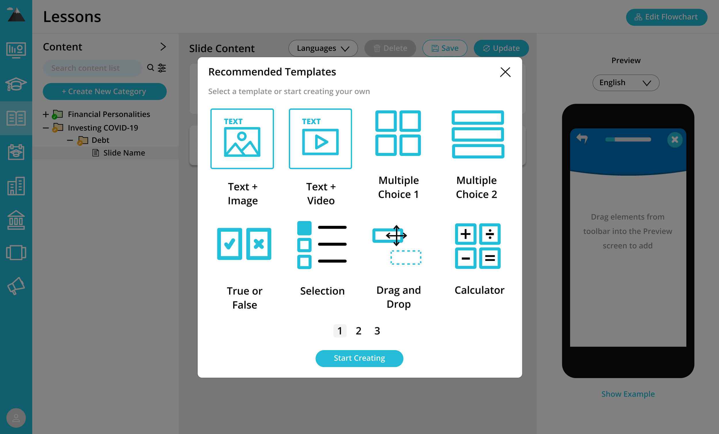
SKETCHES & MOCKUPS
In redesigning Monkiri based on user feedback, I sketched out possible layouts and interactions. I considered the 3 core focuses: Simplifying Concepts, Making Learning Fun, and Connecting To Financial Services
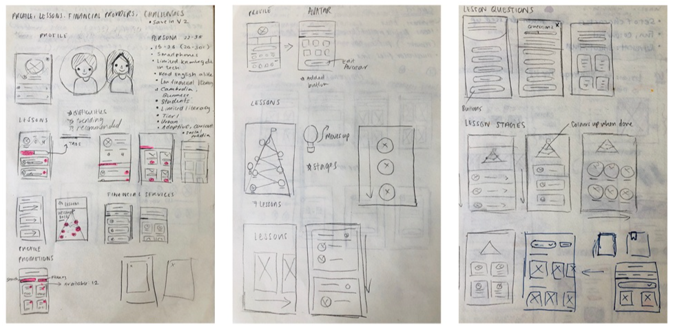
Sketches for the redesign of Monkiri

Some of the wireframes for the redesign of Monkiri
DESIGN GUIDE
Working with a developer and also as reference for other team members, I put together a design guide. I wanted to integrate an overall brand colour to the app and also redid the icons and illustrations for a more cohesive look. As this was done early in my career, I plan to revise the design guide.
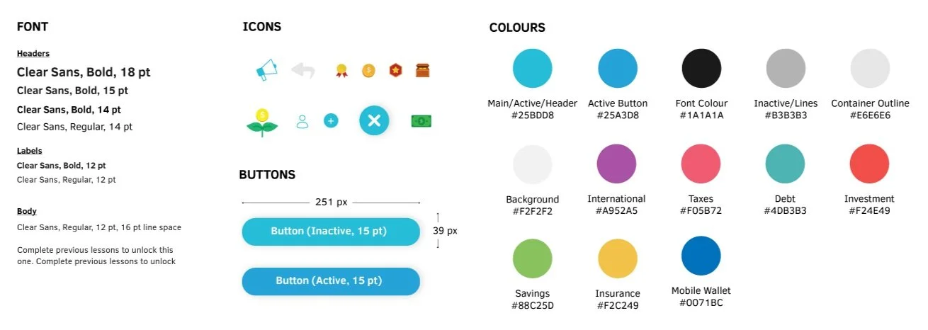
Design guide for Monkiri
THE FINAL V1 REDESIGN
The redesign was for our persona, Kiry (Adam), who is a young adult looking to expand his knowledge in managing finances. He does not have as much technical experience so the interface had to be very natural and simple. We also gathered some insights from the limited user feedback.
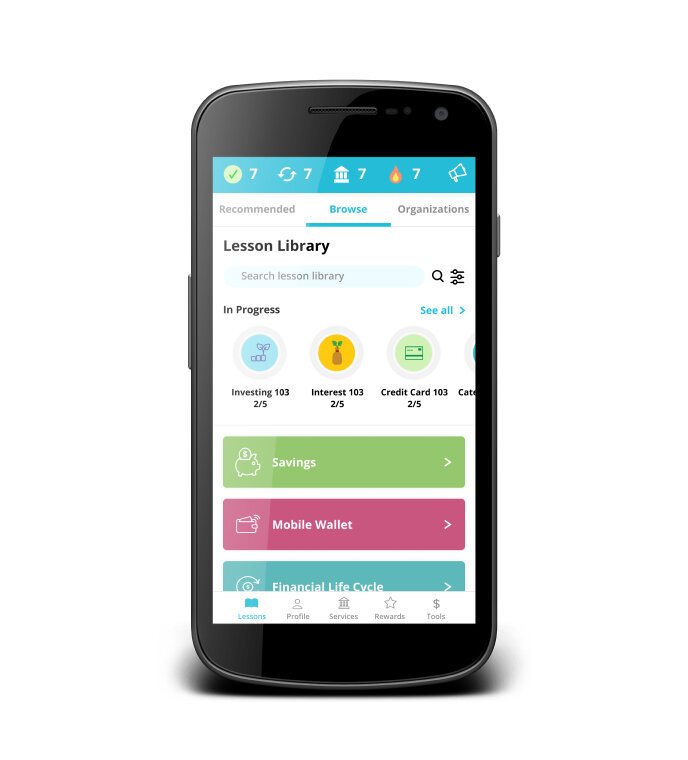
Lessons: Home Screen
The lessons are presented in categories for users to go through and pick the ones they want to learn.
Some of the pain points included: not sure what each lesson is about, the progress bar isn’t too clear, can’t see some of the icons or text clearly

Lessons UX and UI redesigned
Lessons: Navigation
Once they select a category, there is a mountain they can climb based on lessons completed, with the hardest lesson at the top. Some of these lessons are built by the team’s course creators or representatives from financial partners.
Some of the pain points included: unclear where to go back to home screen, not being able to skip lessons, not sure what happens after going through all the lessons

Lessons UX and UI redesigned
Lessons: Questions
Once they select a lesson, questions will start popping up. There are various formats of the questions. They can exit whenever they want and have their progress saved.
Some of the pain points included: progress is hard to visualize, screen looks too busy not sure where to focus first

Lessons UX and UI redesigned
Lessons: Category Completed
Once a lesson is completed, a screen will pop up to congratulate them and share awards they received to continue motivating them to keep learning.
Some of the pain points included: not feeling motivated to go through all the questions, hard to read some of the text, very busy screens

Lessons UX and UI redesigned
Profile
To further keep users coming back and learning, there are some gamification feature such as awards to unlock and also visualization of learning progress and milestones to hit. They can also customize their avatar and profiles.
Some of the pain points included: not sure what each bar is, not sure what the summary of achievements are, the characters aren’t very relatable, hard to visualize progress and stay motivated

Profile UX and UI redesigned
Services: Categories
Since we have financial partners and a large part of the lessons is to educate people so they can find the appropriate services to help them further build their wealth.
Some of the pain points included: not sure what each lesson is about, the progress bar isn’t too clear, can’t see some of the icons or text clearly, not clear that they are buttons

Services UX and UI redesigned
Services: Promotions
Some partners want to further incentivize users with special awards they can gain through completing certain tasks. There are deadlines to these to make it more urgent.
Some of the pain points included: hard to find which ones are ending soon in order to finish those first, too many to choose from and don’t remember which one they were completing, not sure which ones have money rewards, not sure if the boxes are actually clickable

Services UX and UI redesigned
Services: Promotions
Once they find a promotion, they can tap it and see more details.
Some of the pain points included: the text is hard to read, the button is unclear

Challenges UX and UI redesigned
THE V2 REDESIGN PROCESS (6 MONTHS)
NOTE: Due to the nature of this project that’s still in the development phase, only a limited amount of content can be shared.
After a year, the founder secured a government grant and invited me to join his team. The goal was to gather as much data and user feedback to set up the direction for the second redesign of the app. The company has since rolled out the app in both the North American market, as well as Southeast Asia, and made an impact on thousands of users.
V2 Android designs for Myanmar and Vancouver users
USER RESEARCH & SECOND PERSONA
After conducting some research on our existing user base, I put together a second persona and also mapped out the end-to-end user flow to see where we could improve the steps and processes. The new persona reflects our new user base from Vancouver and the various different needs and pain points.

Our second persona, Maria, from Vancouver
JOURNEY MAP
From there, mockups and prototypes were developed with the brand vision in mind (fun yet professional) after rounds of sketching, wireframing, and feedback gathering. I worked together with our development, user testing, content strategy, marketing, and data analysis team members in building out the prototype for both the app and LMS.

Journey Framework
KEY CHANGES
Since the team became bigger, there was more user research collected from interviews and surveys of the experience from the existing user base.
Pain Points: Not visual enough or fun enough for people to keep coming back, some lessons were hard to understand, too many lessons not sure where to start, some users were more familiar with financial concepts but they had to start with the basics, sense of accomplishment wasn’t strong enough.
The key reiterations of the previous version of the app was gamification on the financial learning experience. I took broad ideas from users and my team and mocked up various versions of how we can approach gamification. The final design was inspired by Mario and Duolingo, where users can navigate different worlds and unlock challenges with various difficulties. Please note that due to privacy, there will be limited information on the final design.

Monkiri app design
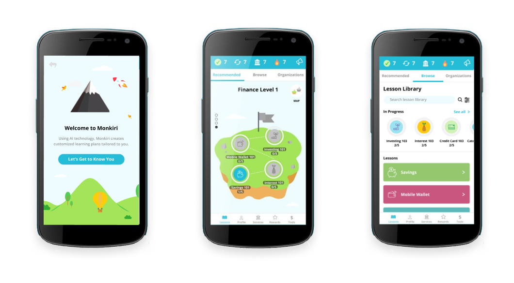
Onboarding (AI Customization): The onboarding experience was redesigned to be more customized where they fill in simple questions and the system leverages AI to customize their lessons. A recommended learning plan is presented.
Learning (Islands): To make the category selection more visual, there are various islands separated by difficulty levels that users can swipe up to reach. This also motivates people to learn and unlock the islands and lessons. Once completed, the flag changes colour as well. If they prefer to browse or search for different lessons instead, they can do so now.

UI sketches

UI prototypes
Profile (Progress Visualization): The profile was redesigned to be more visual, with an emphasis on statistics, and the rewards unlocking was removed as it got too busy. Not too many older users cared about unlocking outfits for their avatar. A “friends” feature was also included to see how the users’ peers were doing to further motivate them to make progress as well.
Financial Services: This section was not changed too much but organized better so it’s easier for people to browse what they need and search for relevant services.
Promotions (Renamed To Challenges): The rewards were highlighted further to attract people to complete them and understand various financial services available.
With every new iteration, we set up user testing and feedback sessions for our user groups and financial partners. I presented our ideas and prototypes and also facilitated some of the sessions. It was amazing working with our supporters and having them provide input on the platforms! Many of the users loved the new designs that I created.
LEARNING MANAGEMENT SYSTEM UPDATE
As more partners joined the platform to build financial content, we also needed a Learning Management System (LMS) to empower our financial partners to create content. My role was to go in and conduct research and make improvements to the experience and interface, while taking into consideration our strategic initiatives.
I developed a design and style guide that I followed. I also leveraged and referenced existing design patterns that would make sense to our users who have likely had experience with platforms such as Google Drive (for our financial partners) and other apps (for our learners). The challenge was mainly finding a balance between designing for the American and the Southeast Asian users as both were different culturally and in their technical competencies.

Learning Management System redesign


REFLECTION
The redesign gained a lot of positive feedback from the team and will be set for more user feedback. As our test group is in Cambodia, it takes quite some time to get user feedback. Overall, I was glad to help redesign such a meaningful product that will be helping many people. It is also a great experience to work with developers to get this product built. We are currently working on integrating a friendly character that will help guide users throughout the experience, ensuring that they understand the functions and interactions.
FURTHER IMPROVEMENTS
If I had more time with this project, I would have wanted to develop the AI feature of this app a lot more that helps with personalizing the lessons for each learner. Everyone learns at different paces, so this is very important both strategically for the business and ensuring a high level of engagement amongst the learners.
I would have also wanted to integrate more animations to make the experience even more fun as most of our users learn visually with the limitations of their technological experiences.
“Christy has been a major help with outlining and refining the designs on Monkiri. Not only has she been able to deliver quality designs, she helped with generating ideas, providing insight, doing research, working within flexible terms and helping the whole team better understand the design features of the app. Christy has able to develop a style guide for Monkiri, and has played a key role with the hand off from designer to developer.”